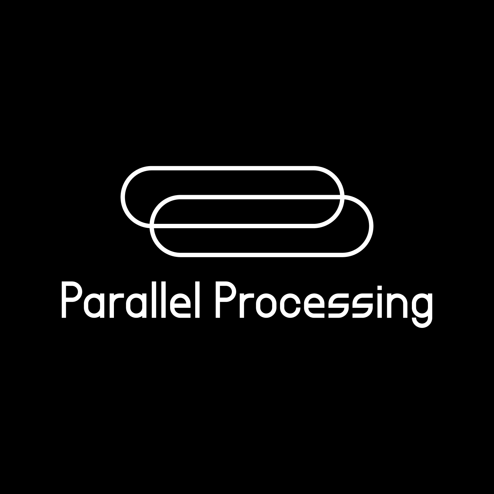
Parallel Processing
Logo and visual identity for an experimental sound art project

Parallel Processing makes music and sound art – somewhere between ambient and techno, often employing experimental and heavily processed audio inputs.
The goal for the logo was to make Parallel Processing immediately recognizable while keeping a minimal look which would work in a variety of contexts – the artist's website, releases, social media platforms such as Bandcamp and Soundcloud, and other promotional purposes.
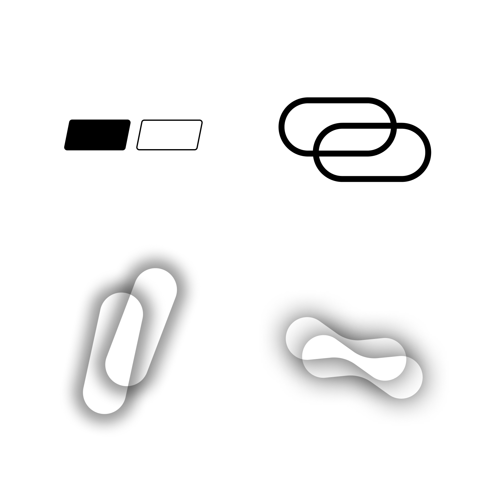
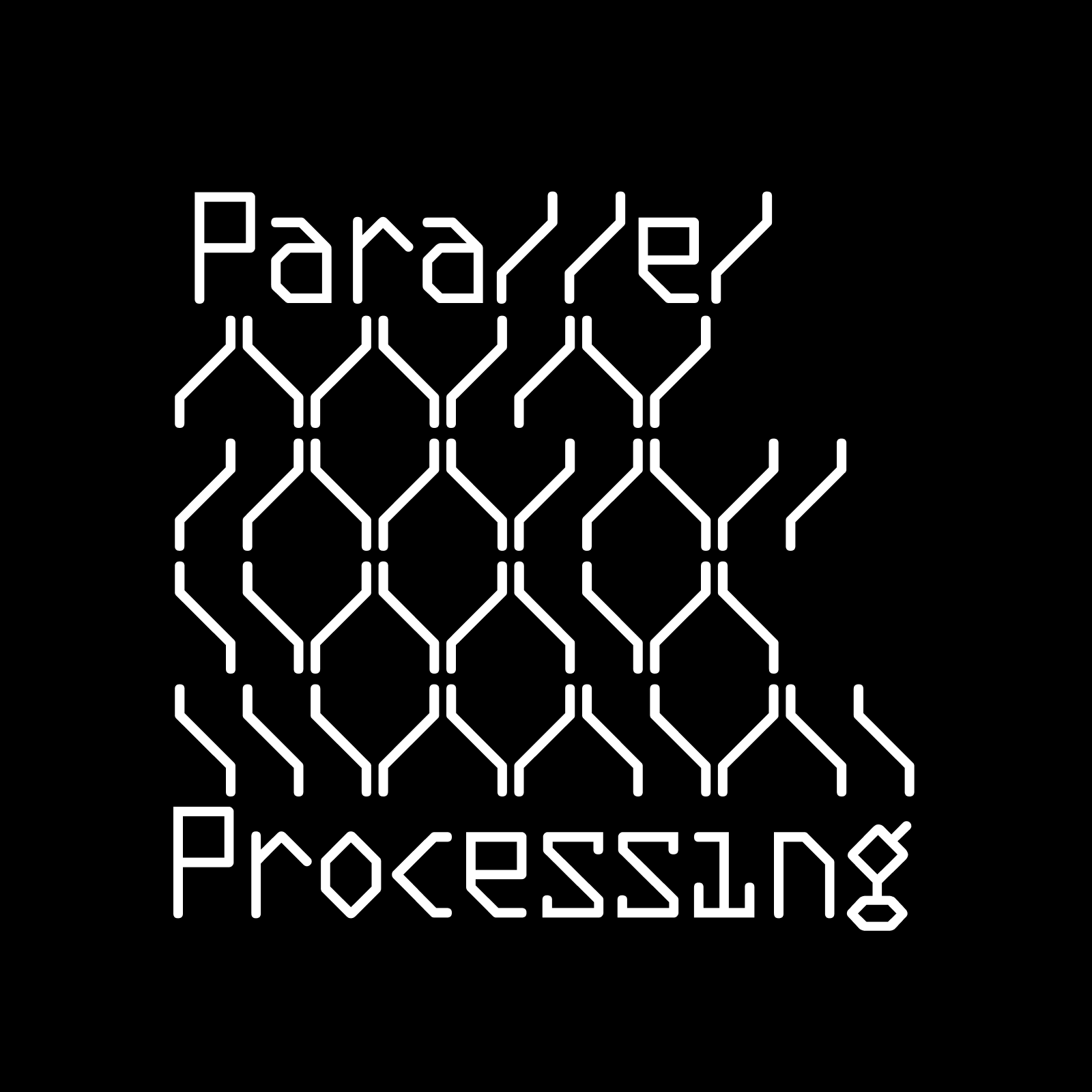
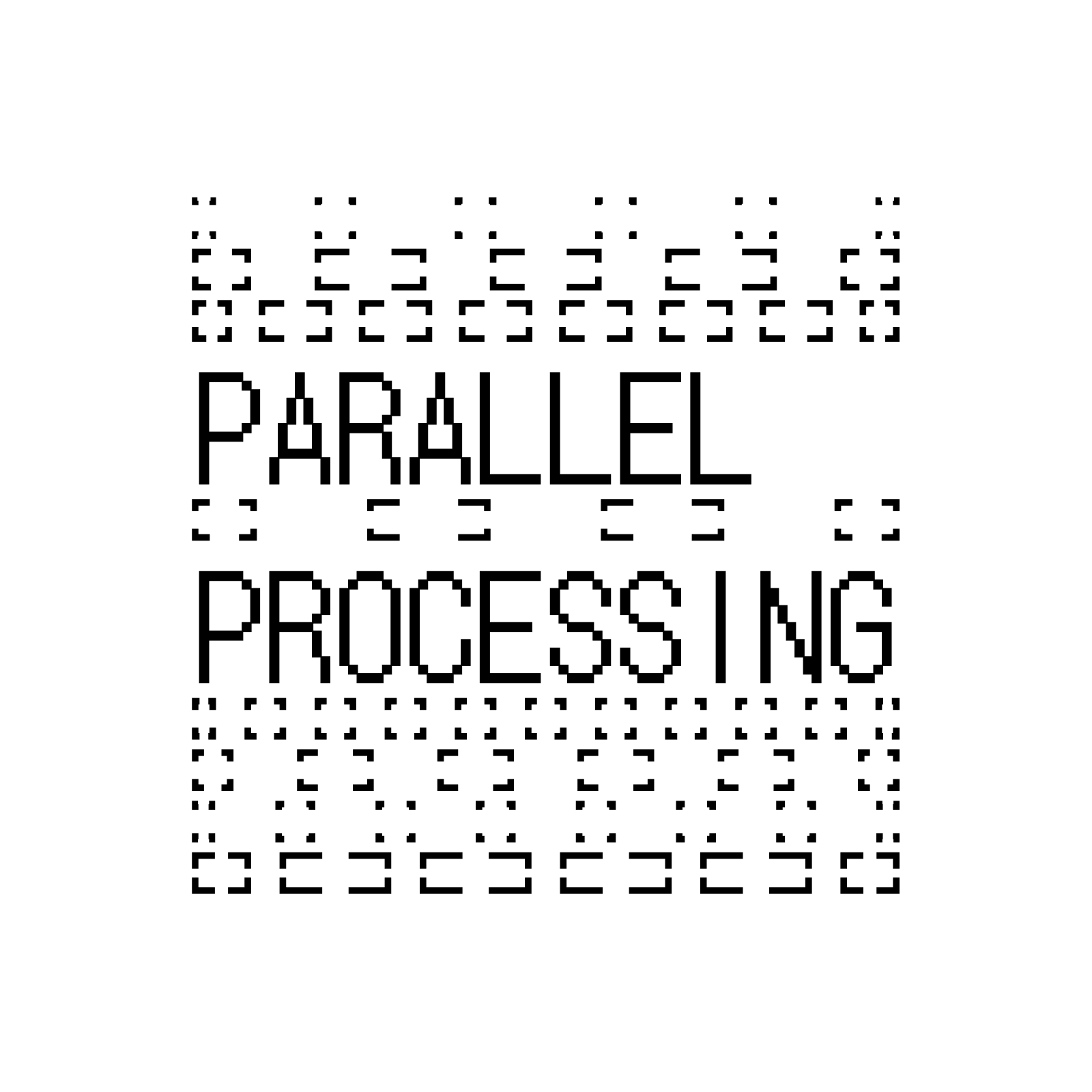
After dissecting the vision and discussing possible directions with the artist, I sketched out ideas around the central themes (processing, filters, systems, parallels ...). I turned some of these sketches into vector graphics and made 3-4 different proposals for possible key visuals.
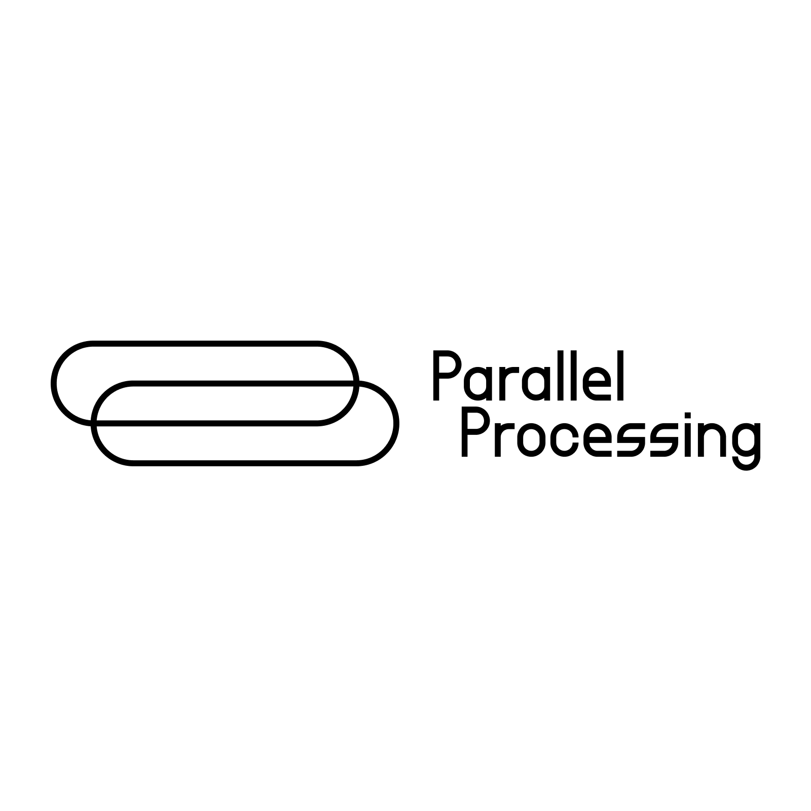
We quickly narrowed in on a shape of two bold parallel pill shapes. After matching the key visual with a variety of fontfaces, we chose the font FORMAT_1452 by Frank Adebiaye and Anton Moglia. Check out FORMAT_1452 on velvetyne.fr.
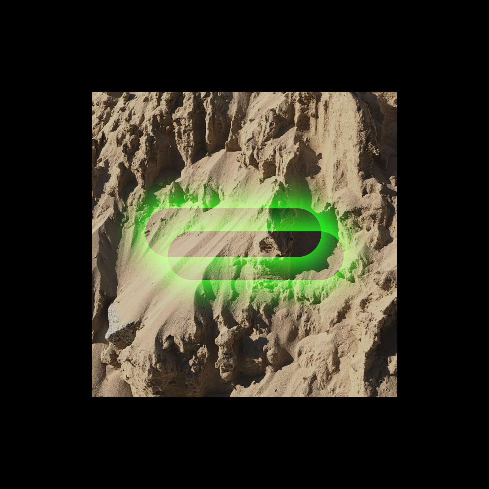
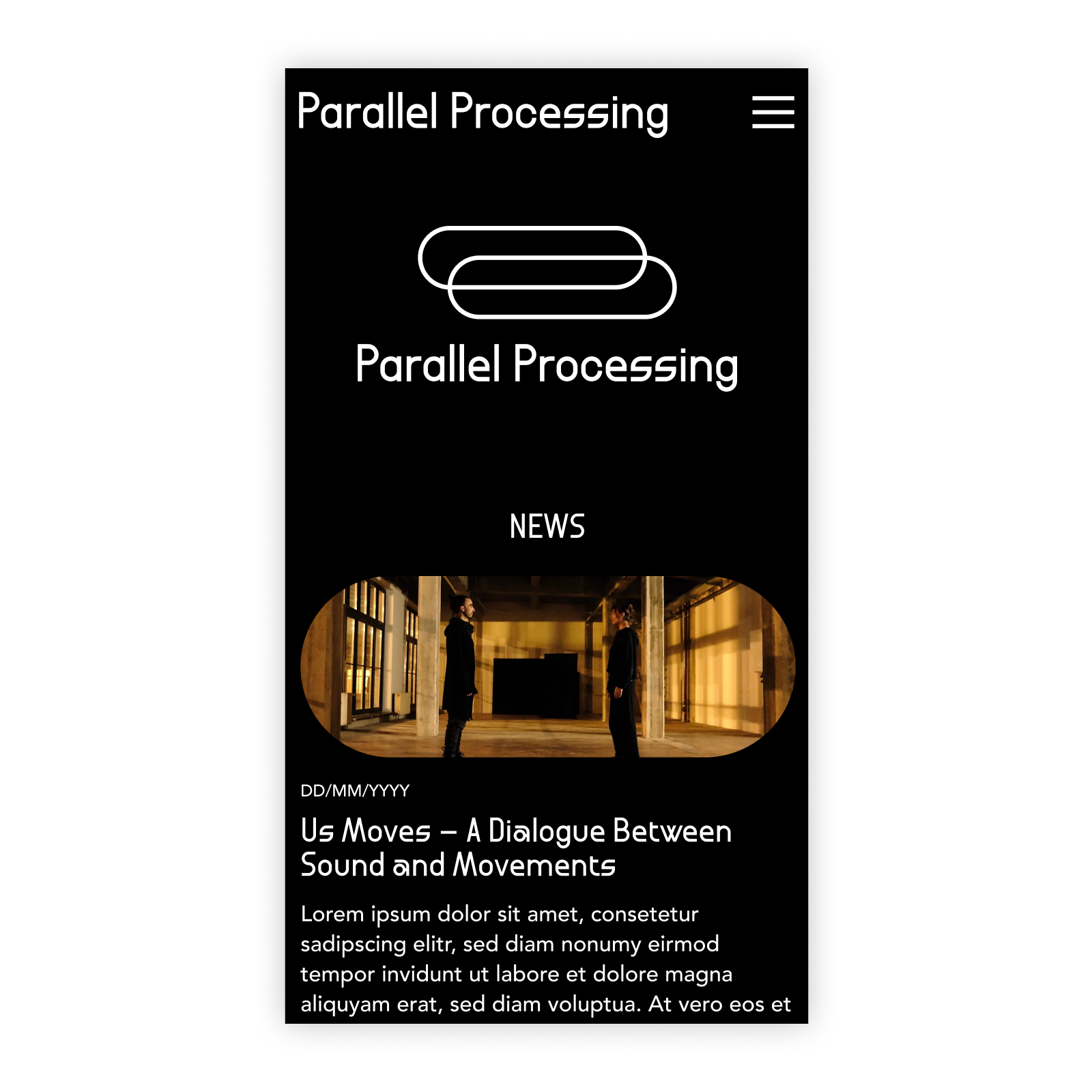
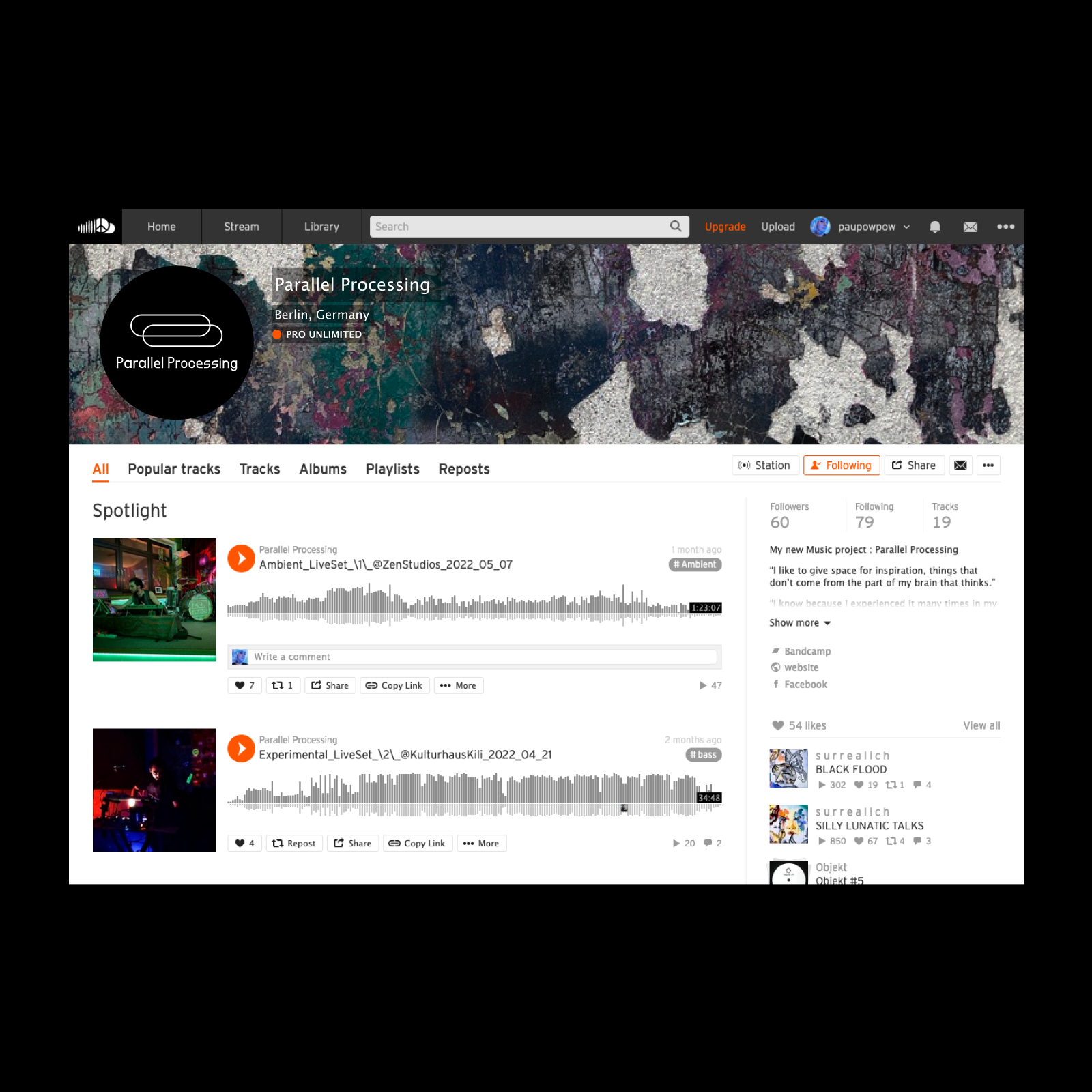
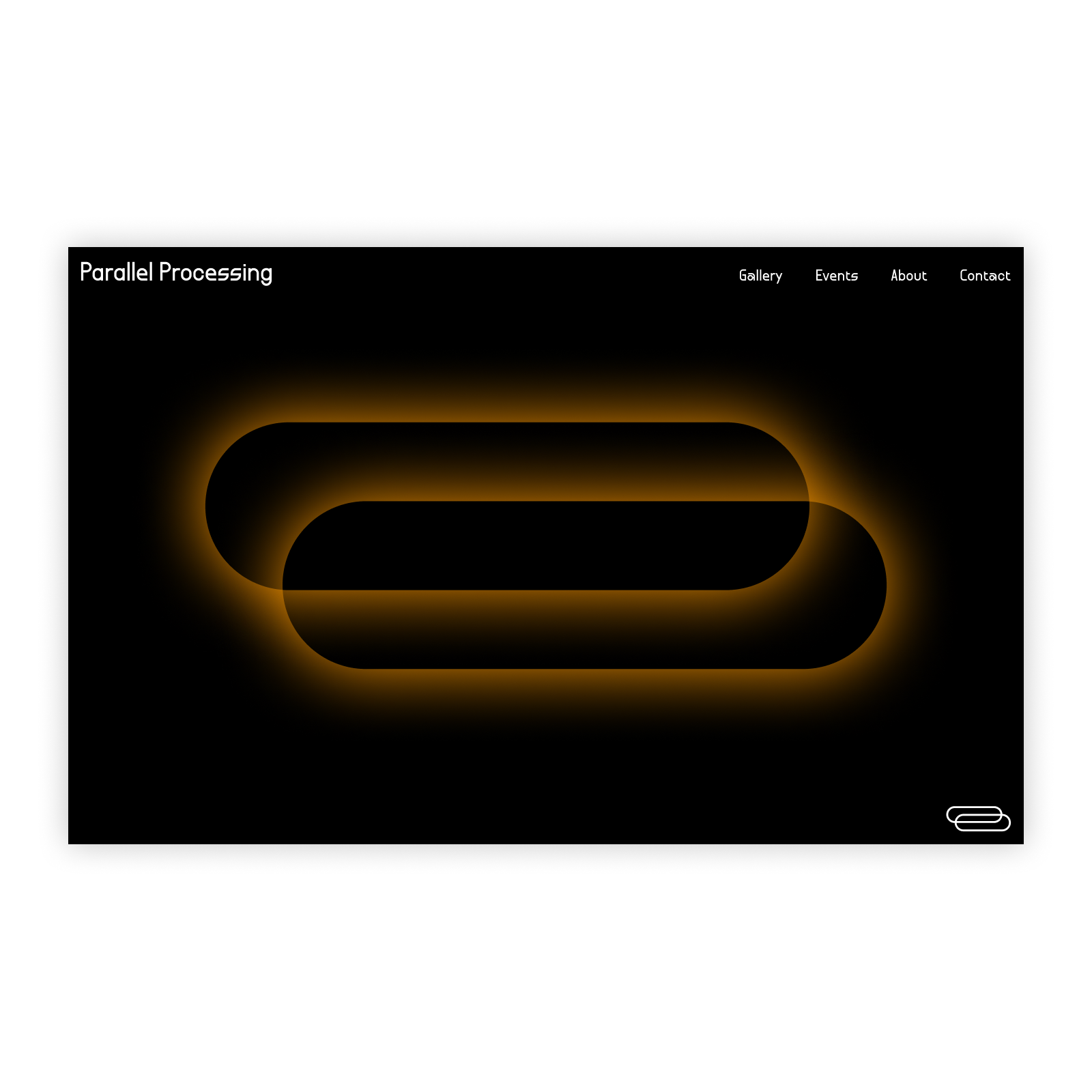
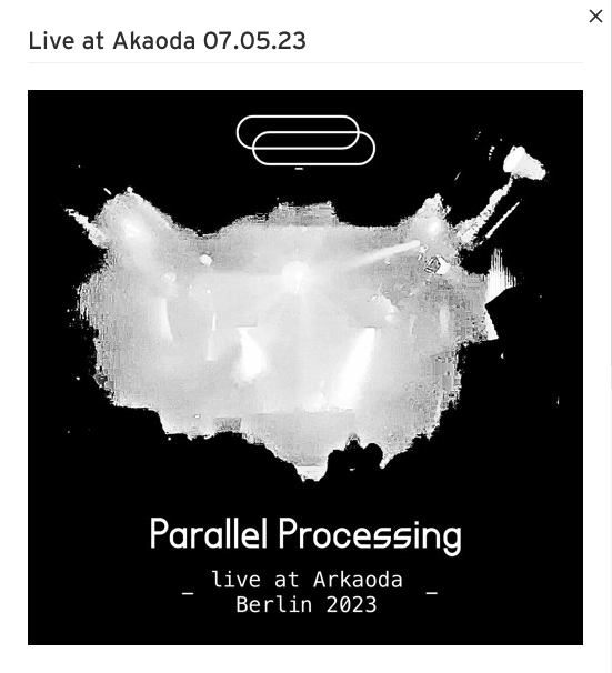
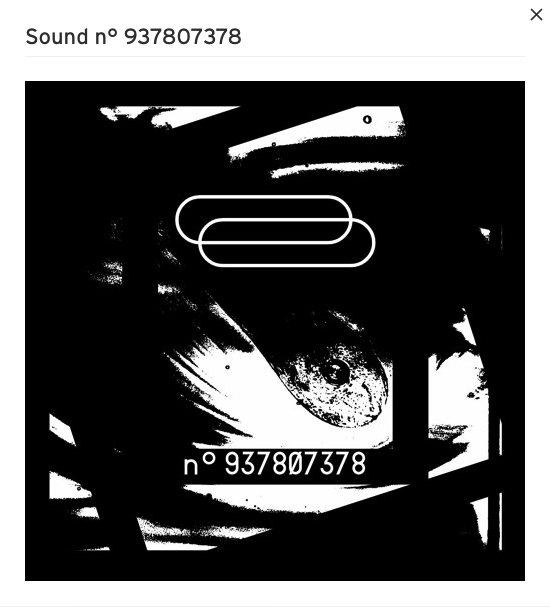
The logo and visual identity is in use on the Parallel Processing project website and on Soundcloud, Bandcamp and Telegram channels, as well as releases. These release artworks/covers (not by me) show how the logo supports and enhances the general visual style of the project: