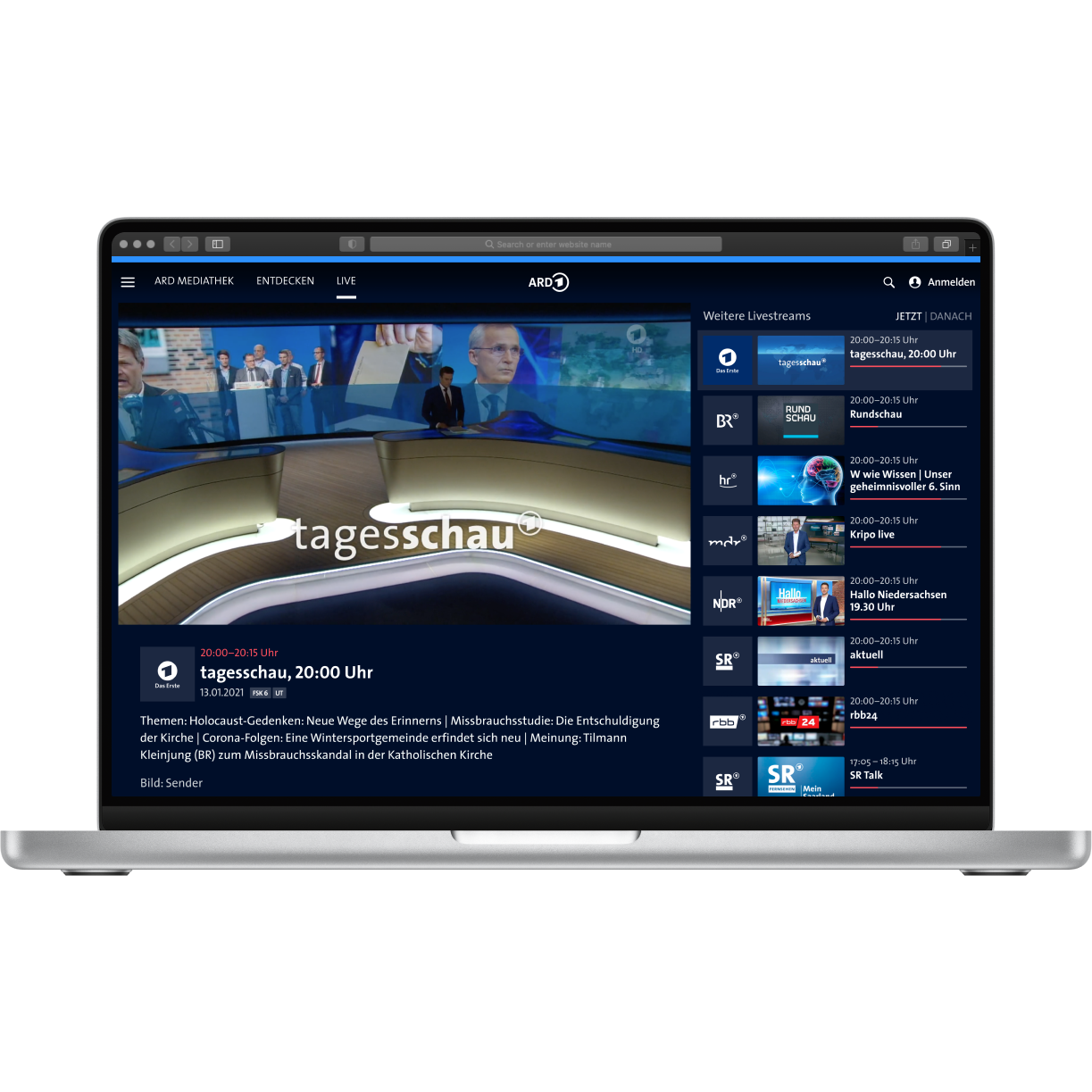
Live broadcasts in ARD Mediathek
Redesigning how visitors of ARD Mediathek watch live broadcasts of 20+ TV channels as well as regional live streams. I optimized the live page for joy of use and clarity information hierarchy, and developed the ARD Mediathek's cross-client design system to accomodate live streaming uses. The ARD Mediathek web app, the TV apps for HbbTV, Android TV and tvOS, as well as mobile apps for Android and iOS are all clients of ARD Mediathek.
The Starting Point
I had the Audience Development team put together a dossier of user feedback on live streaming. In terms of usability and functionality, users mentioned these as their main pain points:
- Navigating to and within the channel list is too complicated (Client: web)
- The regional live streams are difficult to access (only via the respective channel pages), or the integration of regional live streams is missing on the Live page (Client: web)
- Jump marks are expected to watch the beginning of a current broadcast (all clients)
Exploring and navigating between the live streams was particularly difficult in the web client. In addition, missing live stream information and different live stream assets led to an inconsistent overall impression between the individual clients. Inconsistencies in the UI design between these channels are rarely noticed by most users, but they slowed down development processes, causing tech and design debt.
Team & Roles
I reviewed my design work weekly with other designers on the team, who would derive the native designs for iOS and Android from my web and TV designs. I worked with the product management team and the lead of the design team to coordinate the overall concept and feature scope using wireframes.
The designs were handed over to the development team via Zeplin, and everything else was discussed in a meeting and then in chats.
Scope & Technical Limitations
The live functionality of the player itself was not part of the project; however, I was informed about the redesign that was taking place at the same time. In addition to a visual update, functionalities such as jump marks and skip buttons were developed.
Design Process
Benchmarking
I researched UI patterns on competitor platforms with livestreaming modes.
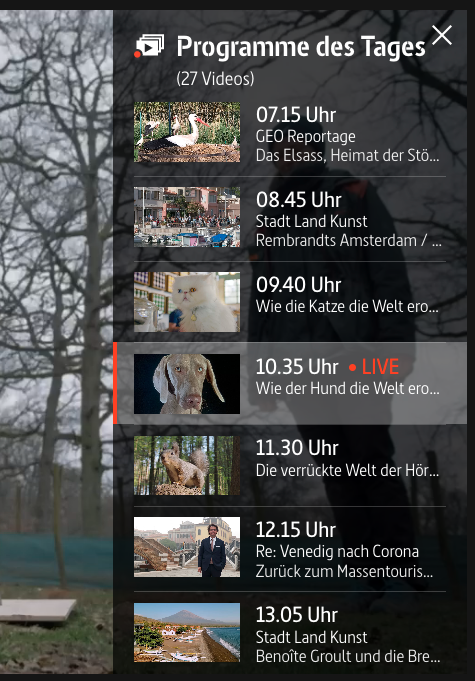
When using the arte player, I was positively impressed by the fact that the most important functionality (program) was located so close to the player and the visual hierarchy (large timestamps) was adapted to this.
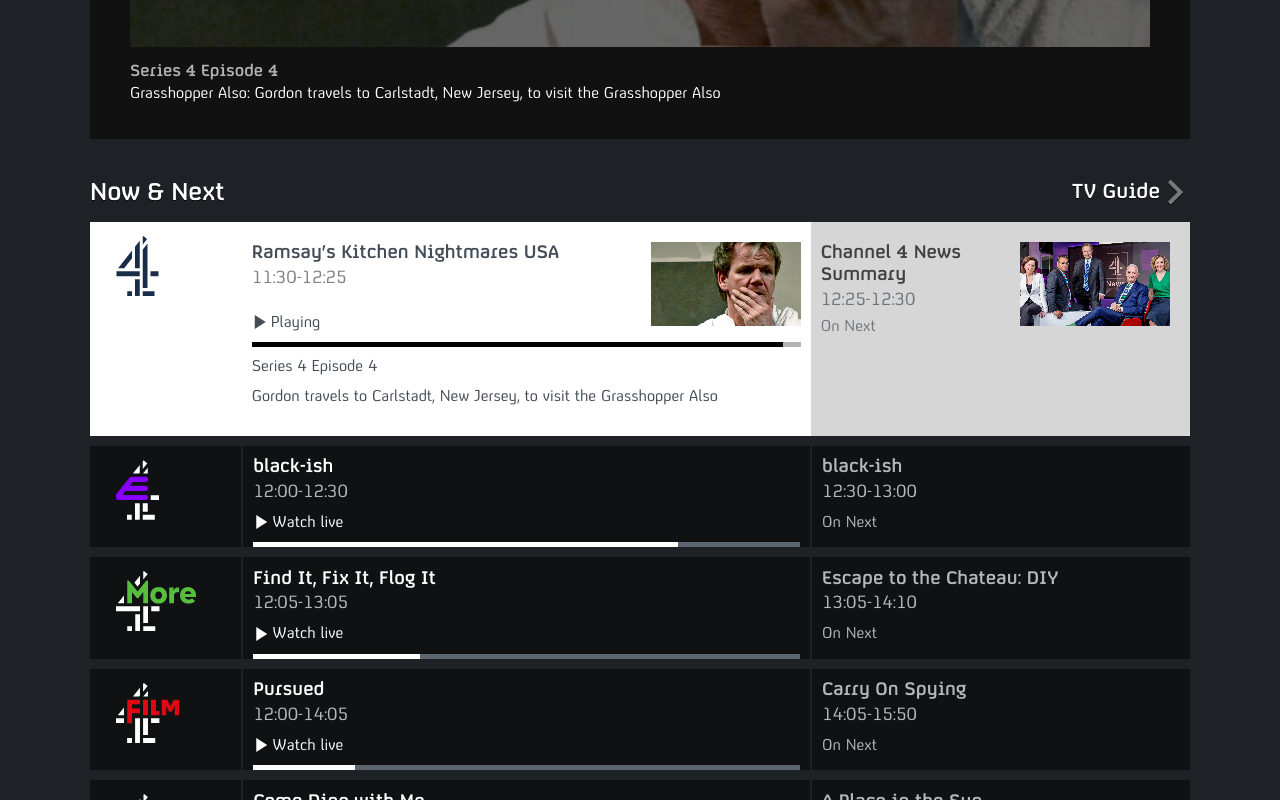
What stood out positively on BBC4 was how the current and following programs were announced: "Now & Next" with a very intuitive layout (2:1 ratio).
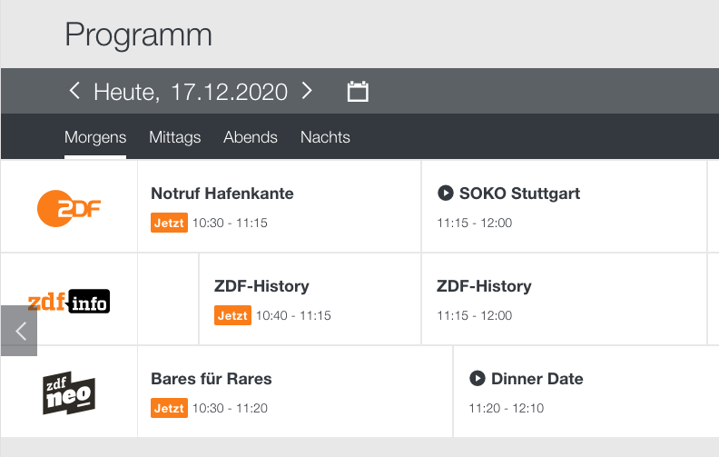
In my evaluation, the program on the ZDF website wasn't working well. Two tab bars one below the other (date, time of day) and directly below them the individual channels very close together presented visual overload.
Concept & Wireframes
In the first step, I transferred the ideas from the research into a mockup that also included the player: with 'Now & Next' information under the player and channel selection in the player.
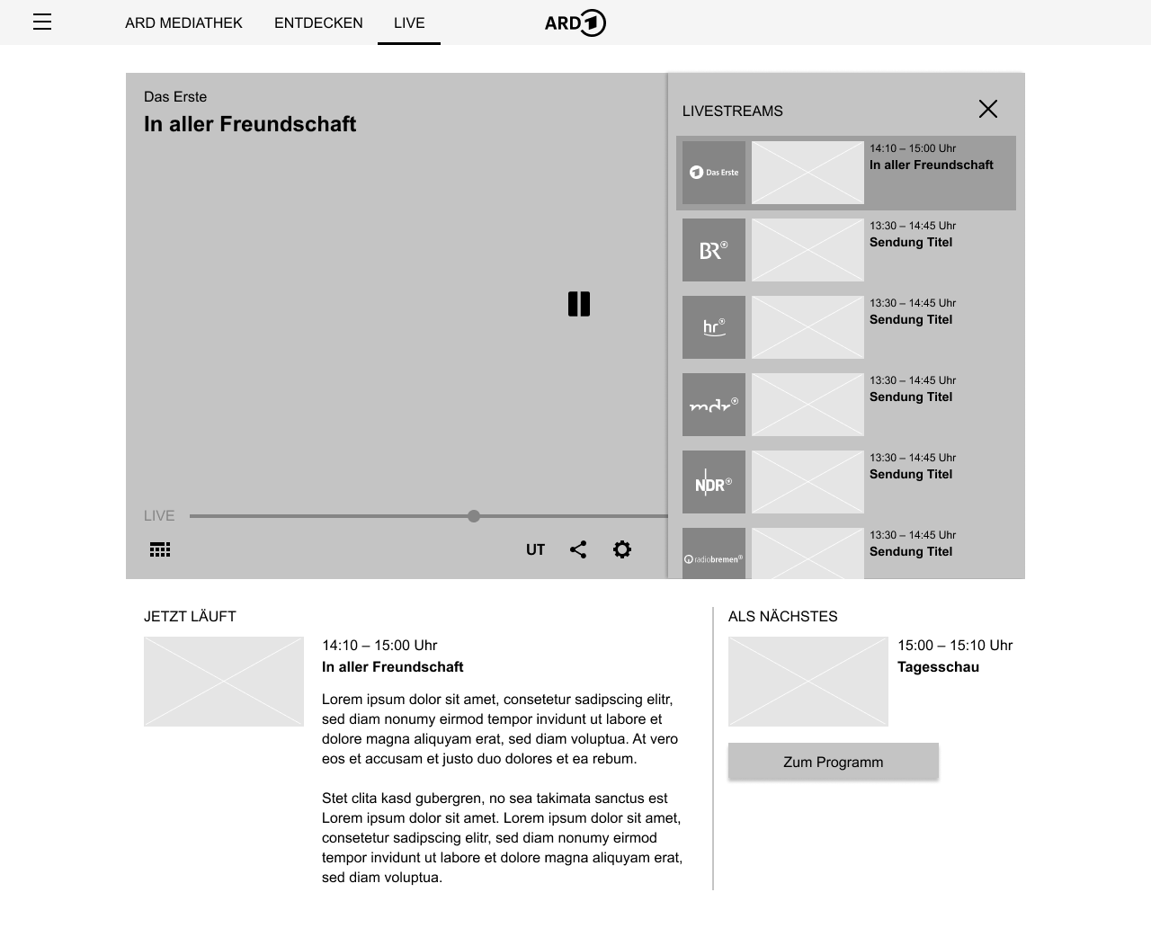
I discussed this draft with my team colleagues. The information hierarchy itself was considered good; we moved the channel selection from inside the player and arranged it next to it:
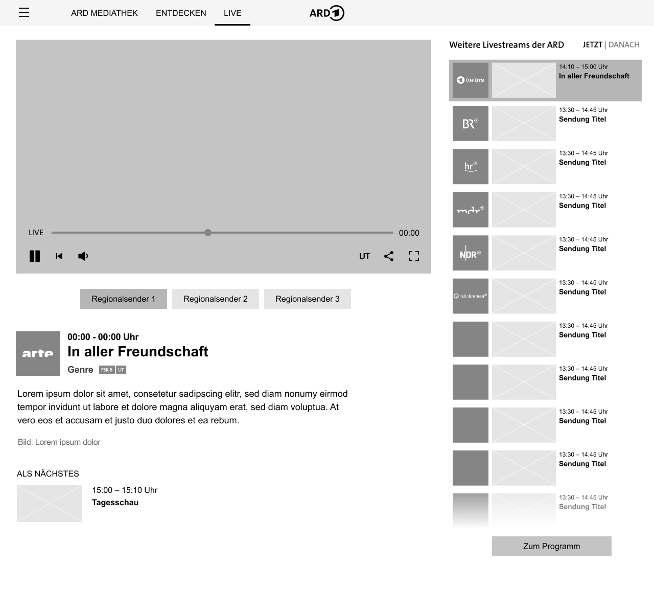
This meant that the 2:1 split for the "Now & Next" information was eliminated, but only for the desktop designs. I continued to use this format in the TV drafts (see below).
High-Fidelity Screen Designs
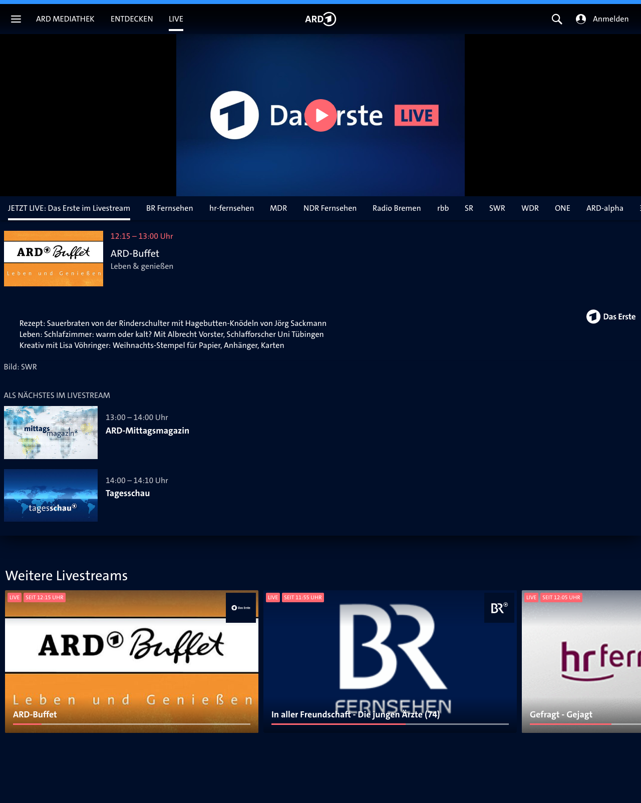
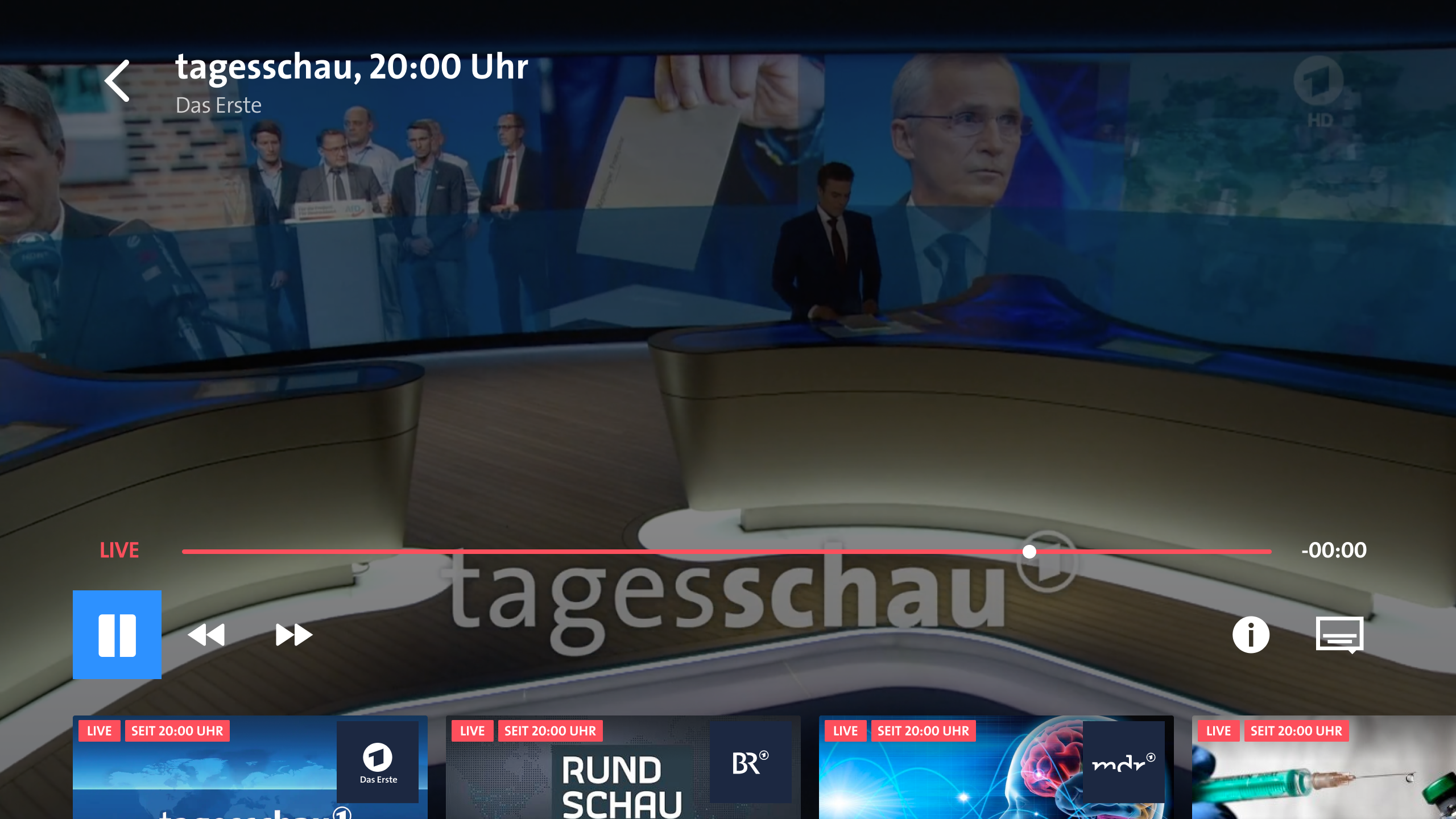
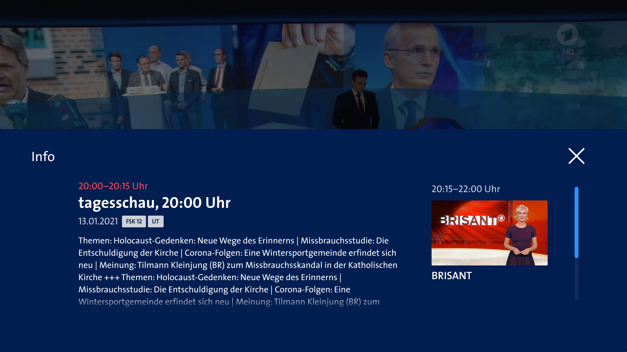
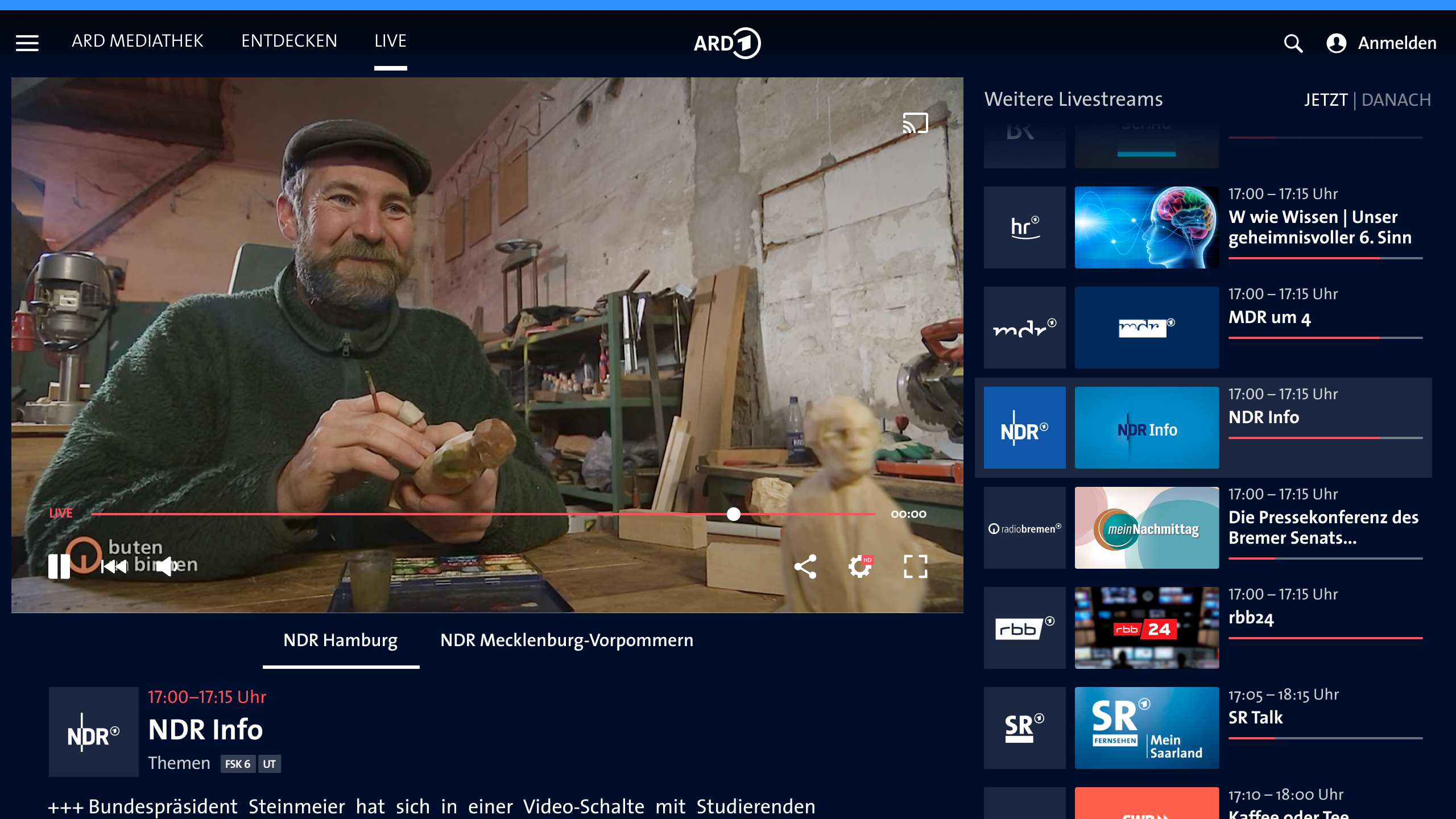
Based on the wireframes, I designed high-fidelity screens. Here are the designs for the default view, Das Erste:
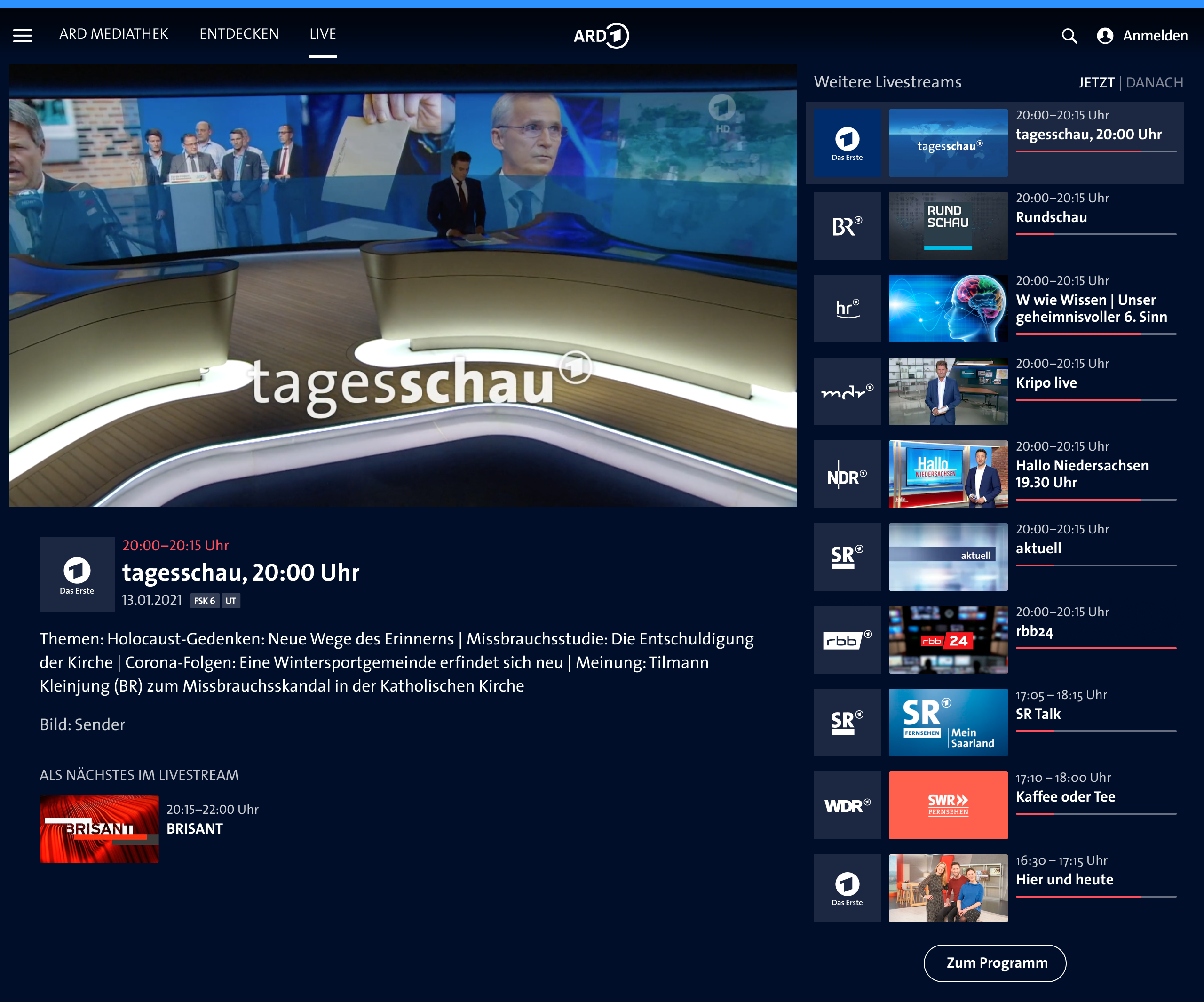
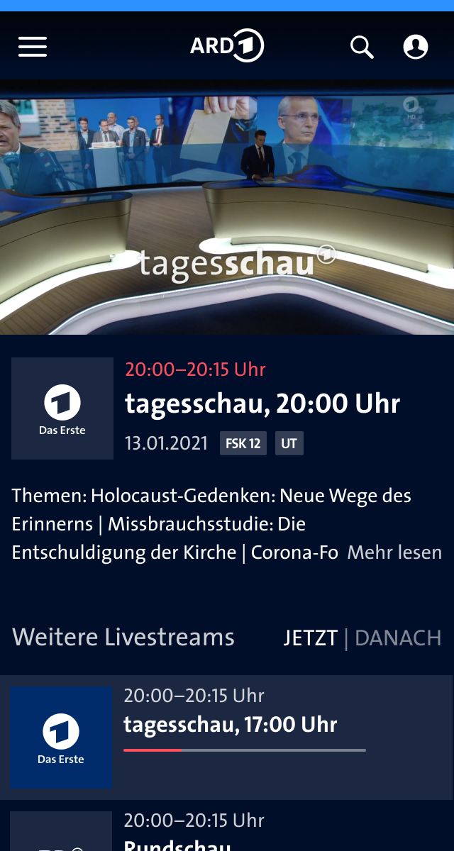
Designs for channels with regional broadcasts
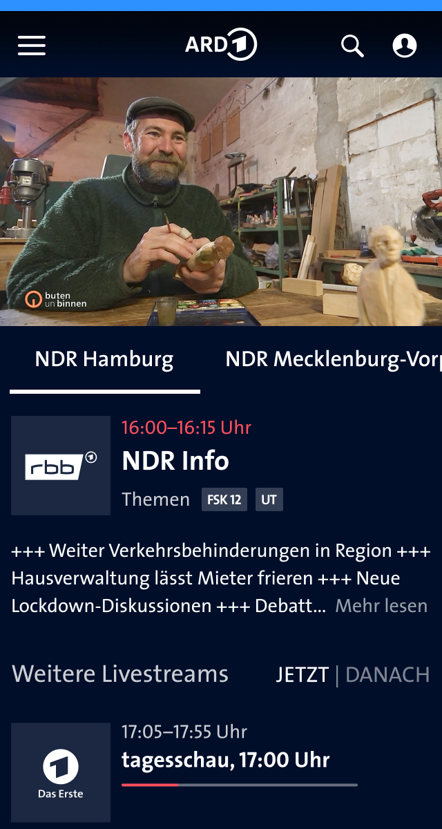
For channels with regional broadcasts I used an additional tab navigation:
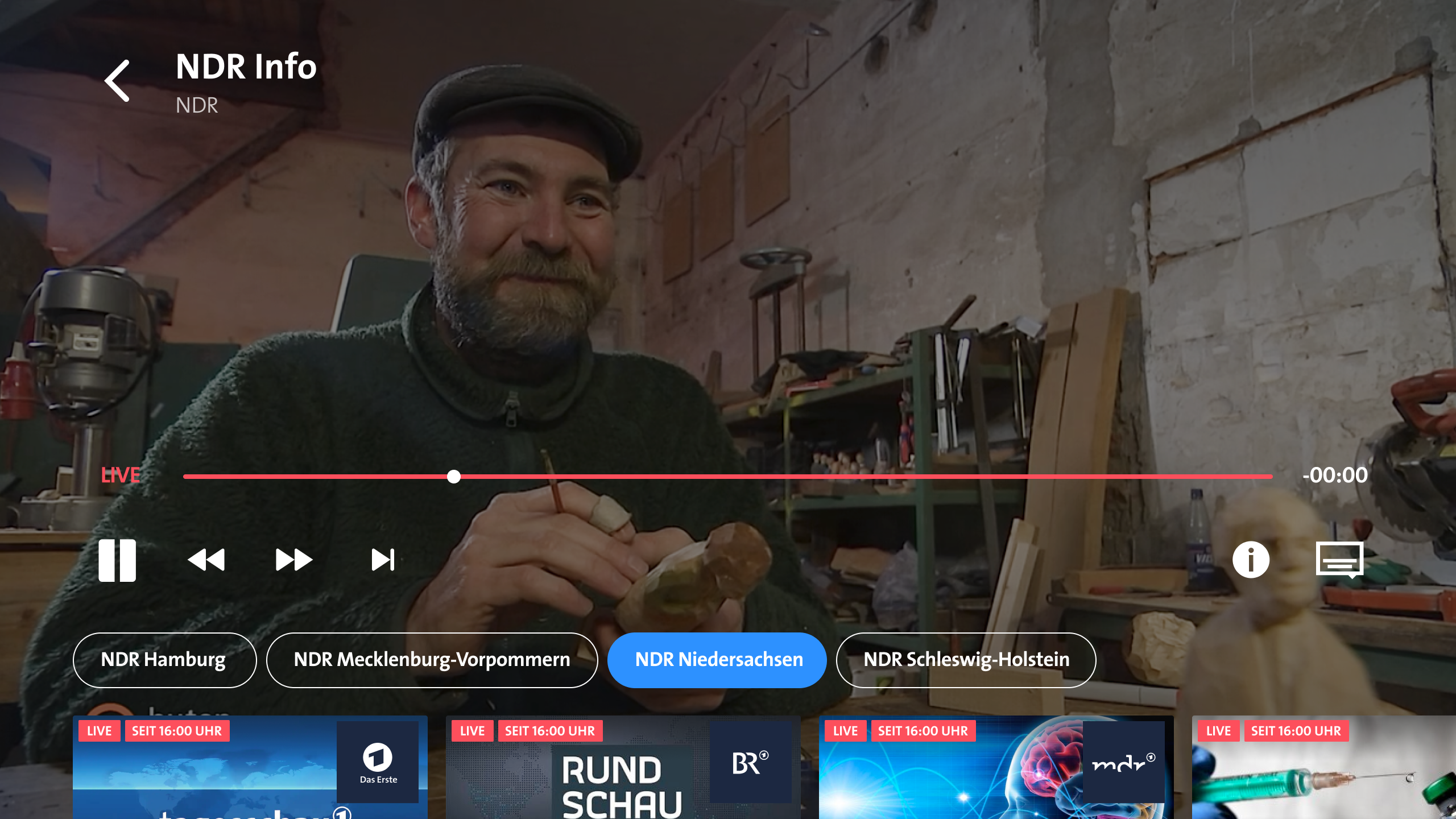
Designs for tvOS
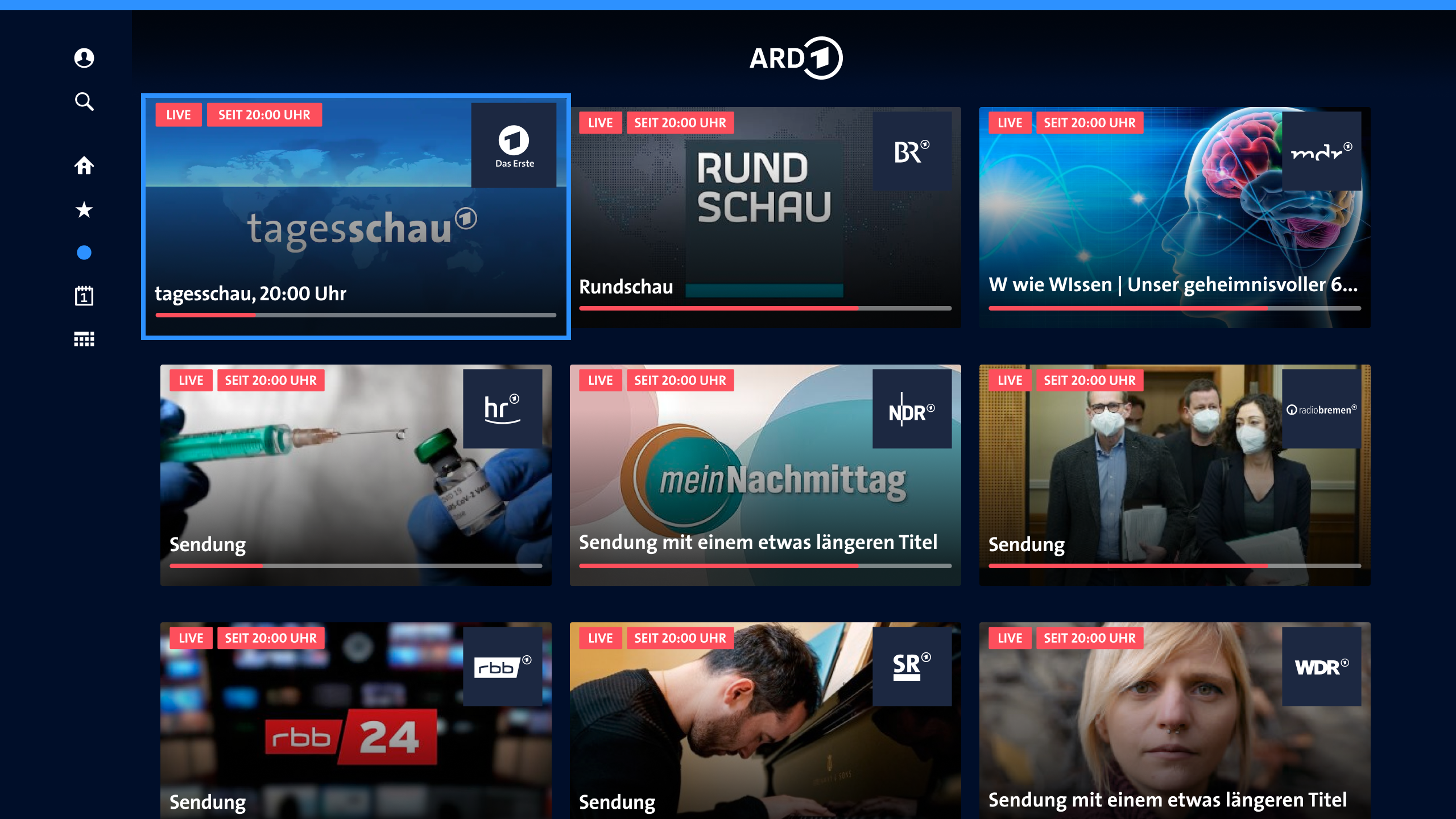
On tvOS, users pick a channel via an enlarged card pattern. I designed the card view:
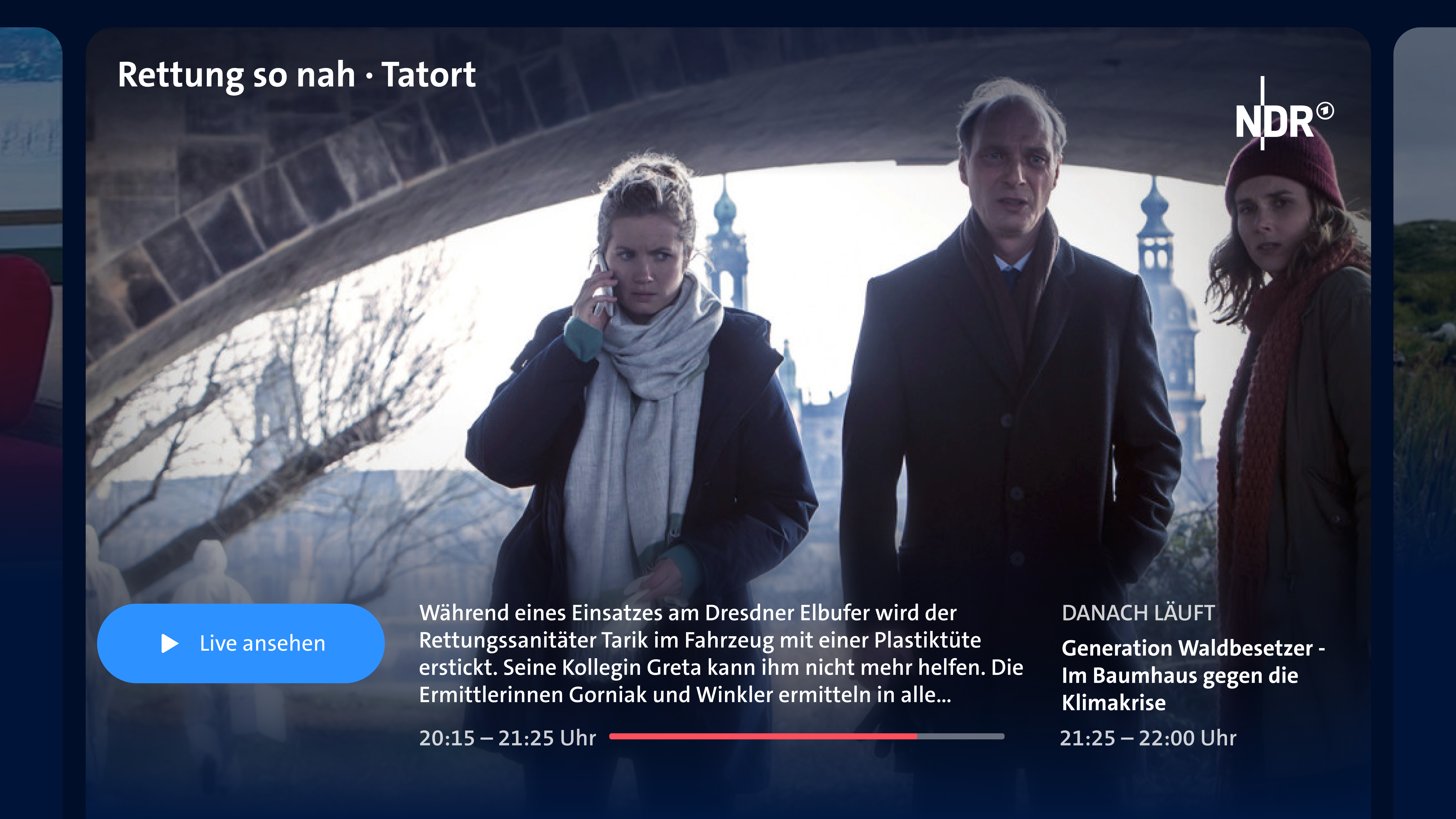
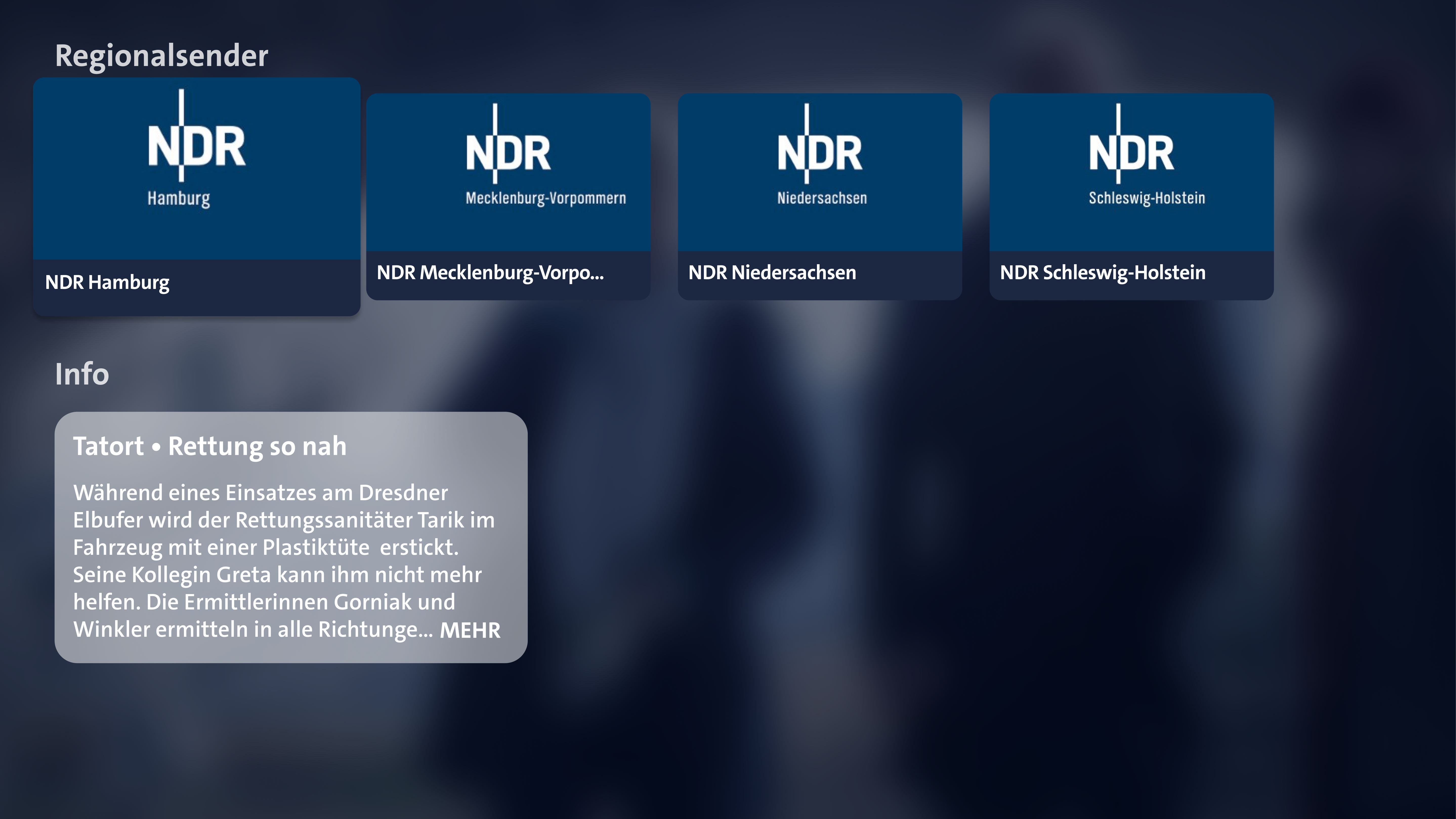
Insights
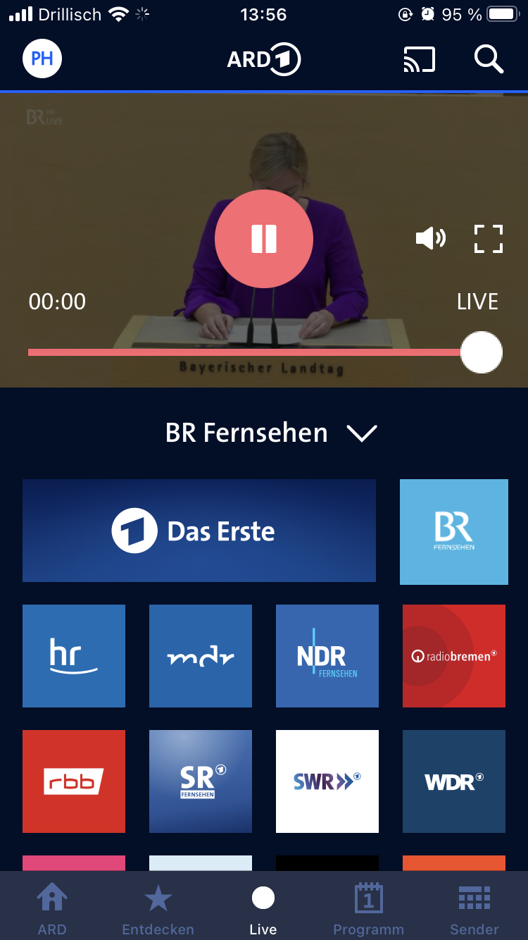
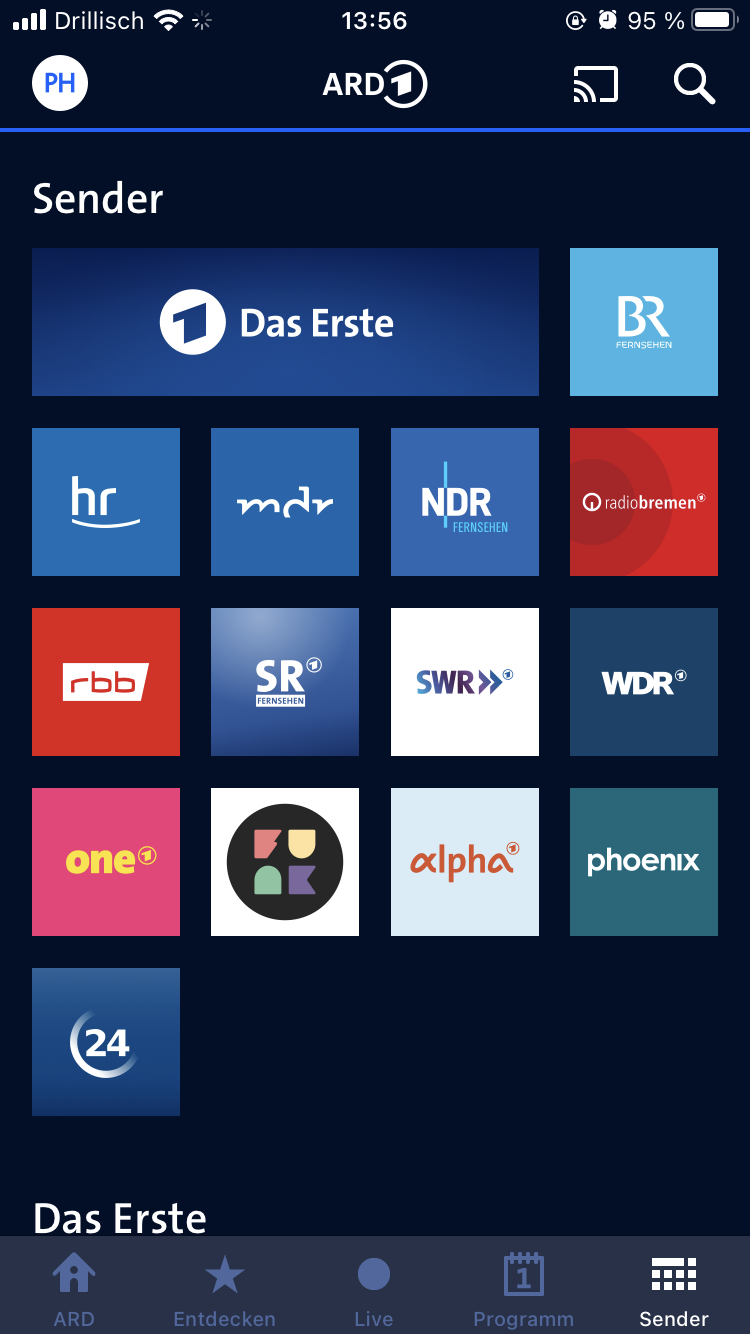
My designs demonstrated that the square tiles with channel logos would be well suited as new UI components. With the channel tile as a recurring component, the channel list was able to bring calmness to the appearance across different screen sizes:
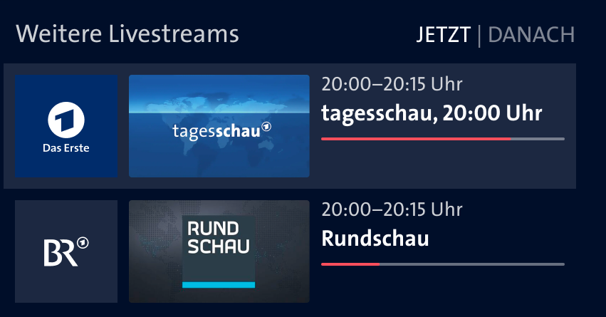
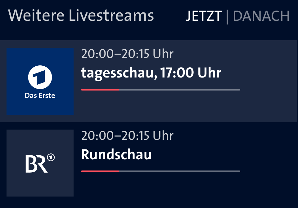
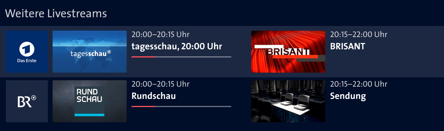
After the launch of the live site, the channel tiles were quickly used in other contexts, e.g. in the video description, in the program, and for channel selection on AndroidTV.
I enjoyed being able to design such a central part of the ARD Mediathek and still enjoy the results months later, for example when I watch live news or sports events.