From paper prototype to stable product: Creating a web app for public broadcasting content network funk
About funk
funk is a public-broadcasting content network that targets audiences ages 14–29. It can be described as an innovation lab inside the German public broadcasting system: at its launch in 2016 it was the first online-only entity, introducing the rather old-school public-broadcasting sphere in Germany to a modern way of operating and producing. The networks' portfolio encompasses a broad range of content creators, collectives, and shows – all with the value proposition of high-quality content that is 100% ad-free.
funk had launched on YouTube (and other social media platforms) with a portolfio of about 40 channels, each producing web video content for a specific audience and platform. It also launched with a homepage which introduced its mission and listed each channel in the network, and with an app for daily news & entertainment on Android and iOS.
My Role
A few months after the launch, the homepage and apps needed to be replaced by one web app to free up development and curation costs. For the development of the web app, a product team with a product owner, a web developer, two content managers, one media producer and myself as UX/UI designer was formed. Our task was to come up with the concept and the overall look & feel of this new web app.
Design Process
After completing the first design sprint and receiving feedback, the team decided to start the design and development of an MVP (Minimum Viable Product). In this case, the MVP would be a simple video player with navigation between channels or videos, and a menu with links to subpages. Search functionality, content categories and any personalization (recently watched, recommendations) were out of scope.
Part 1: Minimum Viable Product
As a designer, I wanted to find a consistent and enjoyable way to show video content and make it discoverable.
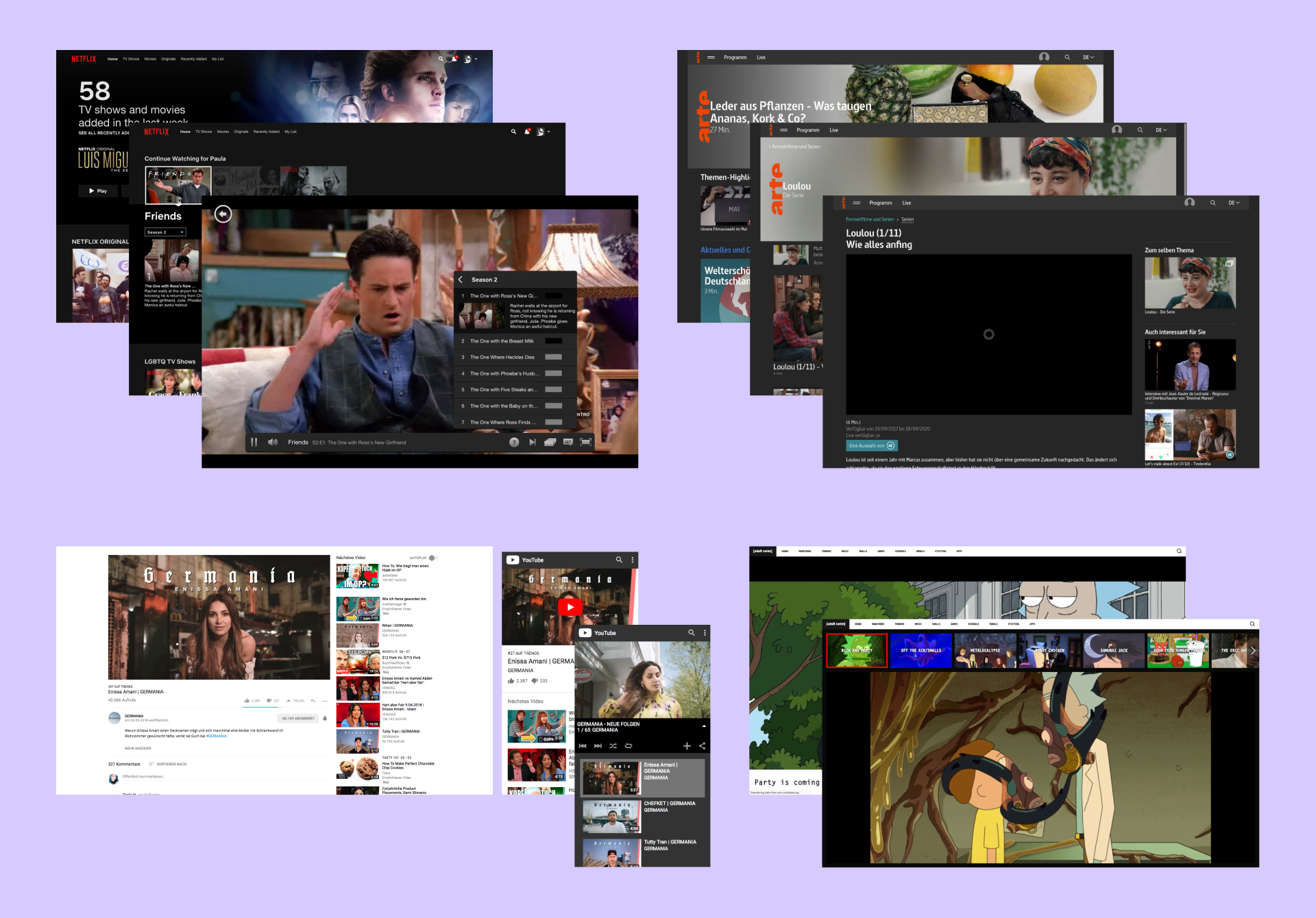
Video platforms giants such as YouTube or Netflix were certainly always at the back of our minds when discussing the interaction design principles. These platforms have by far the biggest impact on users' expectations towards a new interface.
I made a point of researching alternative video streaming platforms such as Super Deluxe, Freelance.tv or Adult Swim. Public-service websites were rarely eye-opening, with arte.tv as an exception. These streaming platforms were more realistic in terms of workload, and often had taken characteristic design choices for their niche audience instead of a mass product. Another page I loved, presenting music instead of video, was Because Recollection.
Prototyping
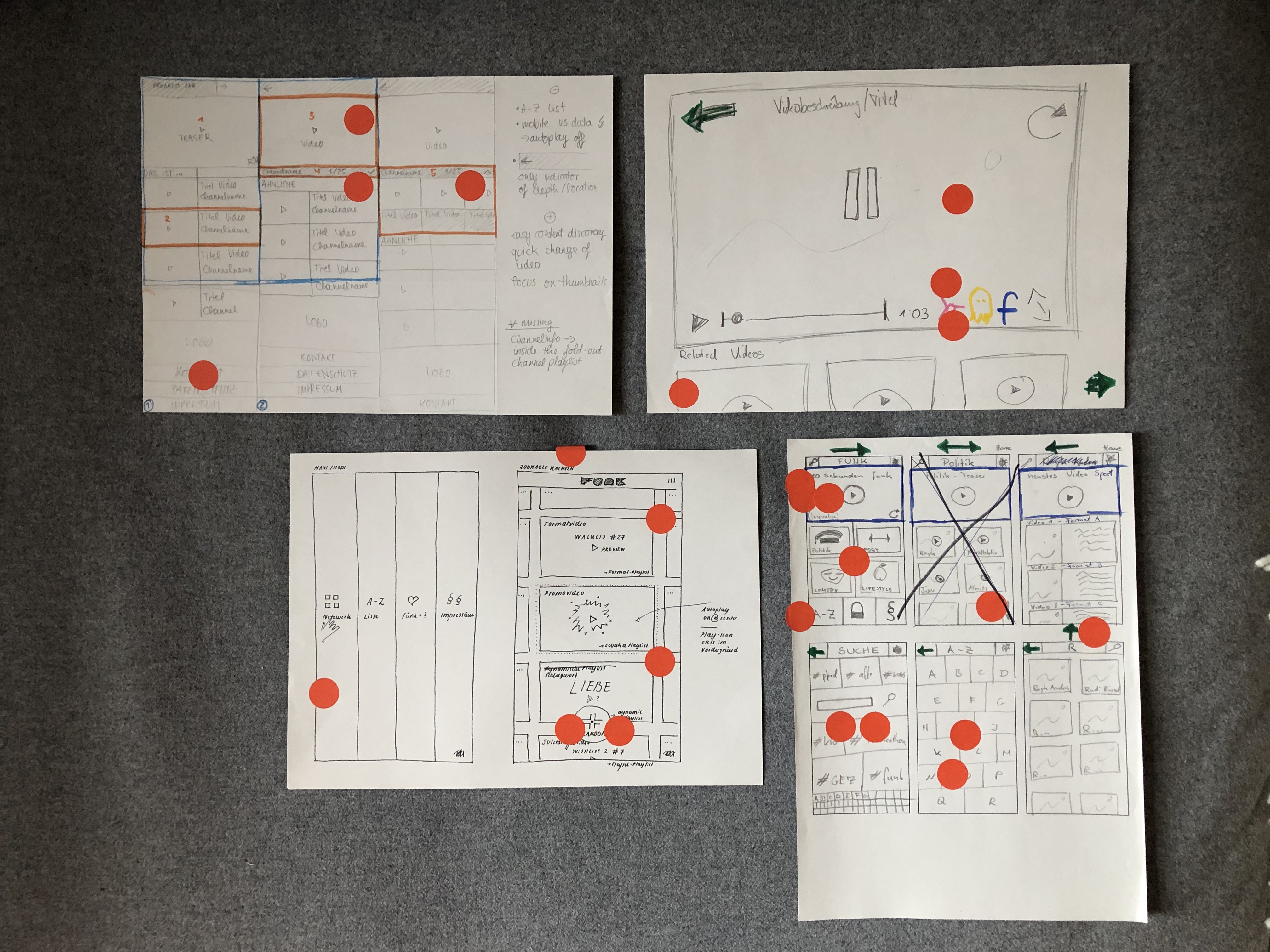
I designed the player view focusing on the mobile view. Starting on paper helped me to get a feeling for appropriate button and text sizes, as well as try out many different configurations.
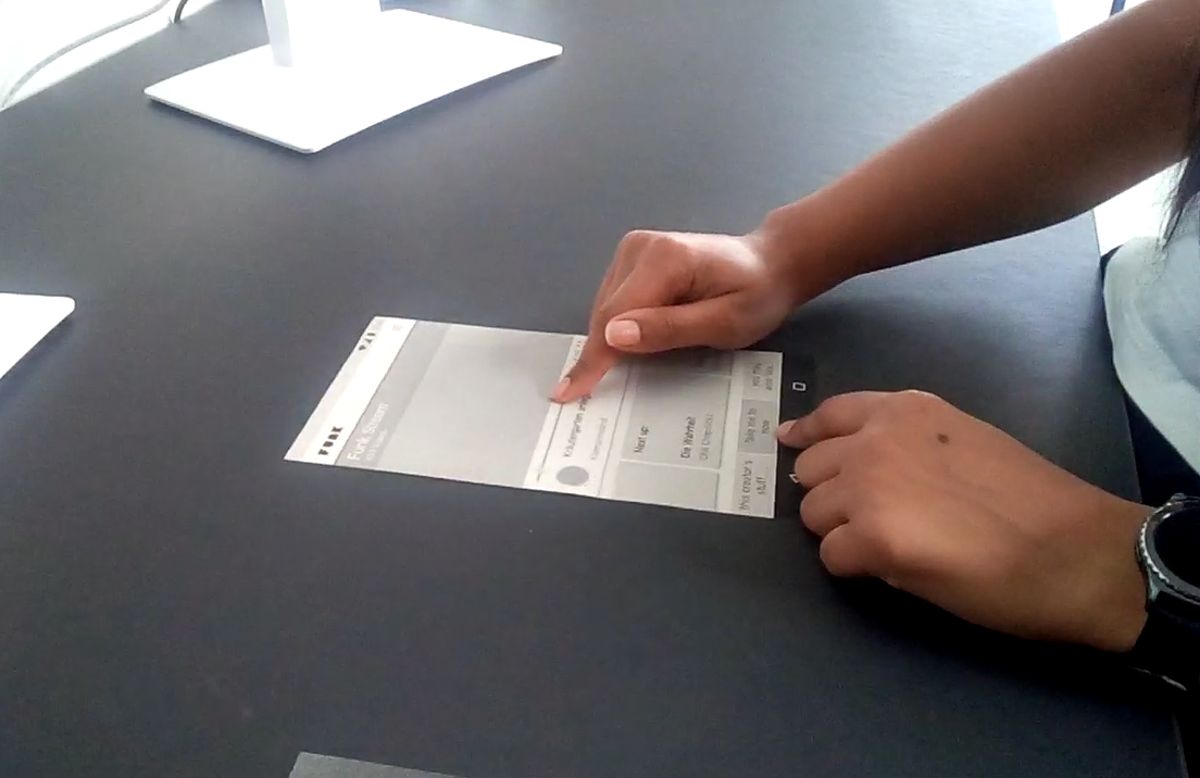
We tested 2 variants of the design as paper prototypes with interns and students around the office. I came up with the tasks that users had to fulfil, and recorded audio and video of each session. Users responded well to this lo-fi testing: They would tap on the paper UI in front of them, and I would then create the change in the interface by laying down the corresponding paper view.
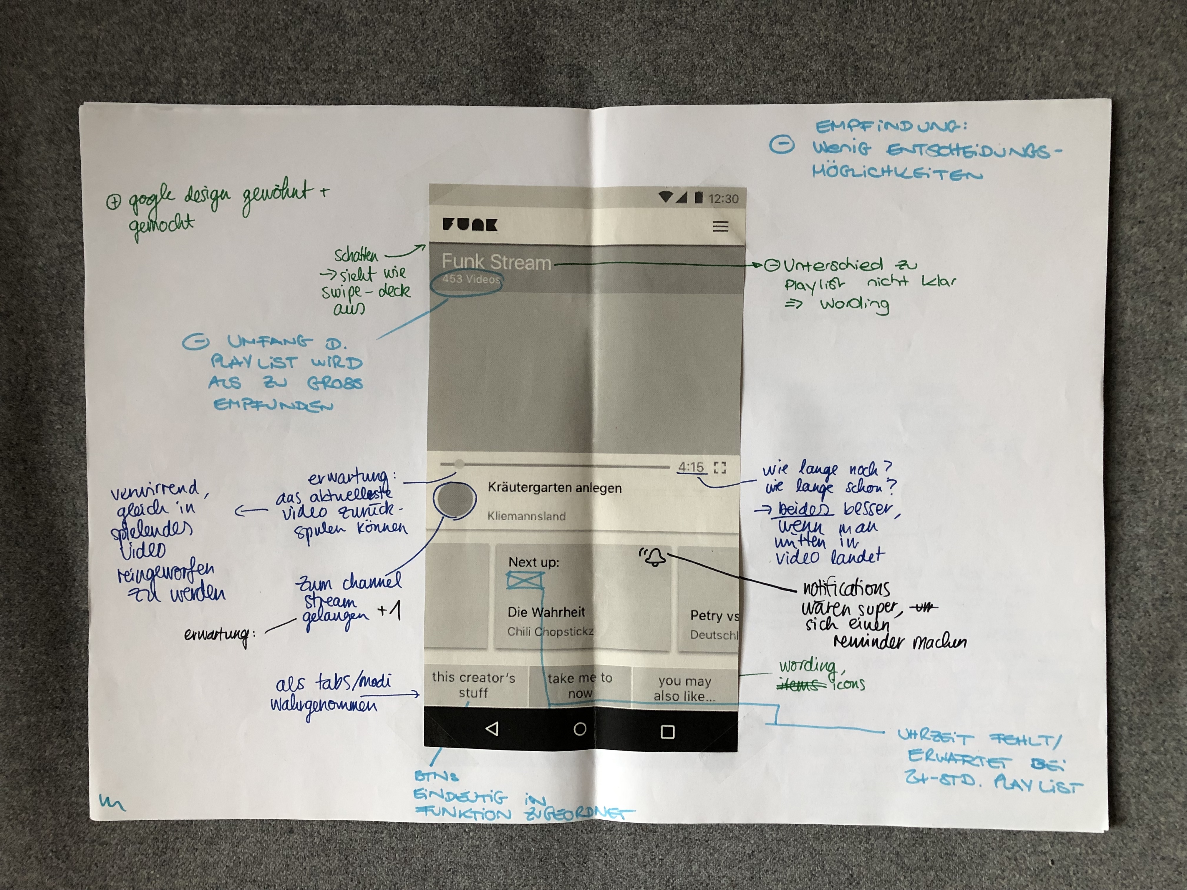
Conceptual and UI Design
I worked in the feedback from the testing and created wireframes which detailed interactions and transitions. These enabled the two developers on the team to start implementing some functionalities in the backend while the UI design progressed.
My design intention was to flaunt the fact that the web app was so minimal by giving the player a "retro" look. This could make the site more confidently playful and invite users to explore the content by zapping – because they couldn't do that through other ways yet.
Insights from the MVP Launch
There was a lot of pressure to release the web app quickly. The team cut a lot of corners in regards to features, and it also influenced my design decisions negatively. For example, by fitting the video player and navigation in one view, I gave up common usability patterns in favor of delivering something that would be quick to implement and also feel different than before.
We spent a lot of time looking for innovative approaches to web video consumption, inventing new viewing experiences. Ultimately, we had to realize that this was because there was not a clear strategy what funk needed its website and apps for.
Part 2: Re-Design
After the MVP launch, with more time and resources, we we wanted to improve the web app further and produce a sustainable feature roadmap for the new platform. In addition to being a UX/UI Designer, I also took on Product Management responsibilities as I was already very engaged with the project.
Research
This time around, I was able to base my design work on data insights. I drew interesting insights from website analytics, from a usability test, and from a survey.
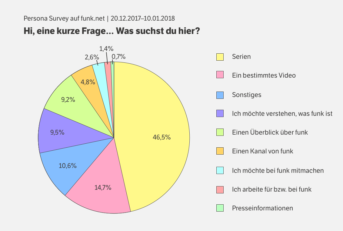
The user survey we ran on the web app during three weeks showed to us that 46% of visitors came looking for series.
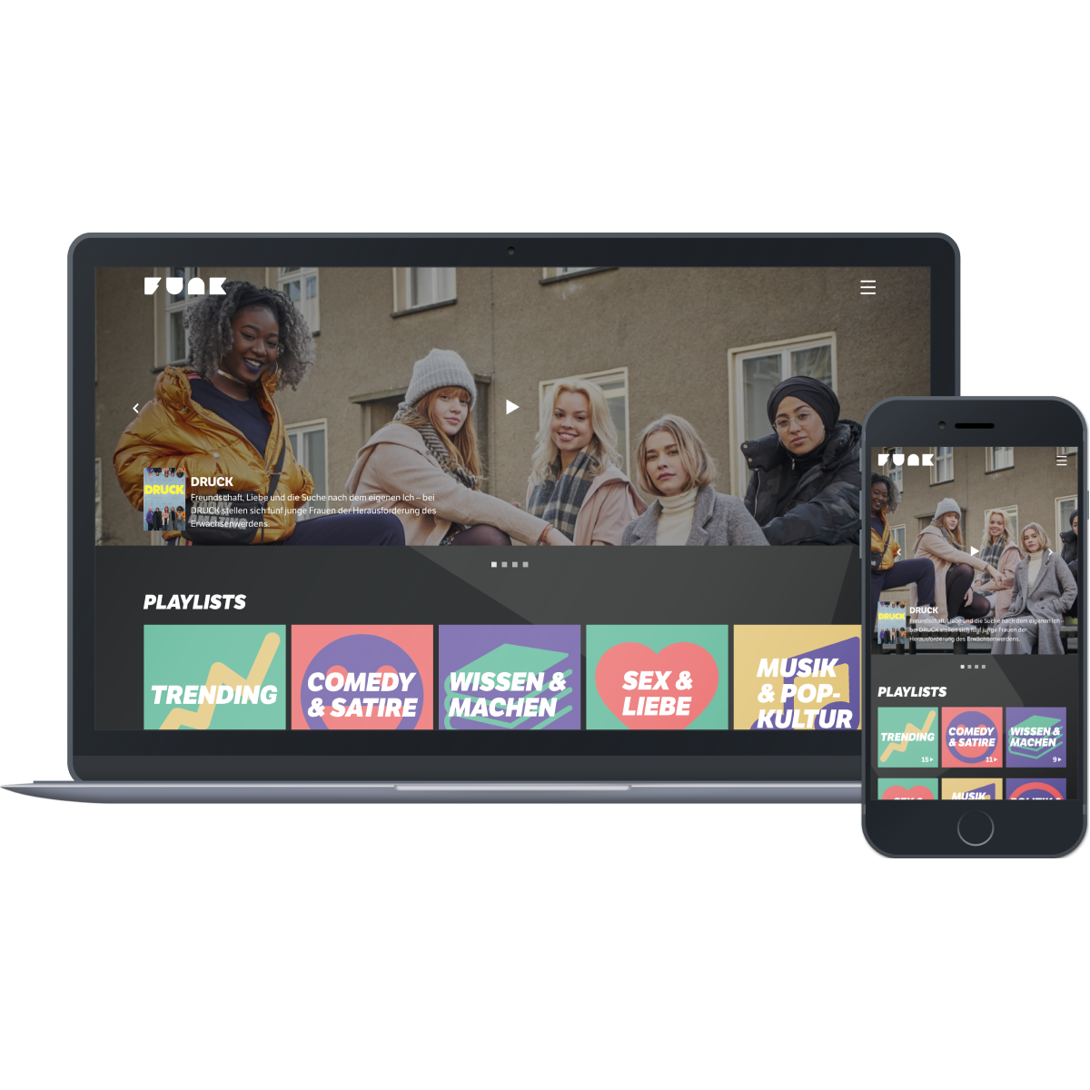
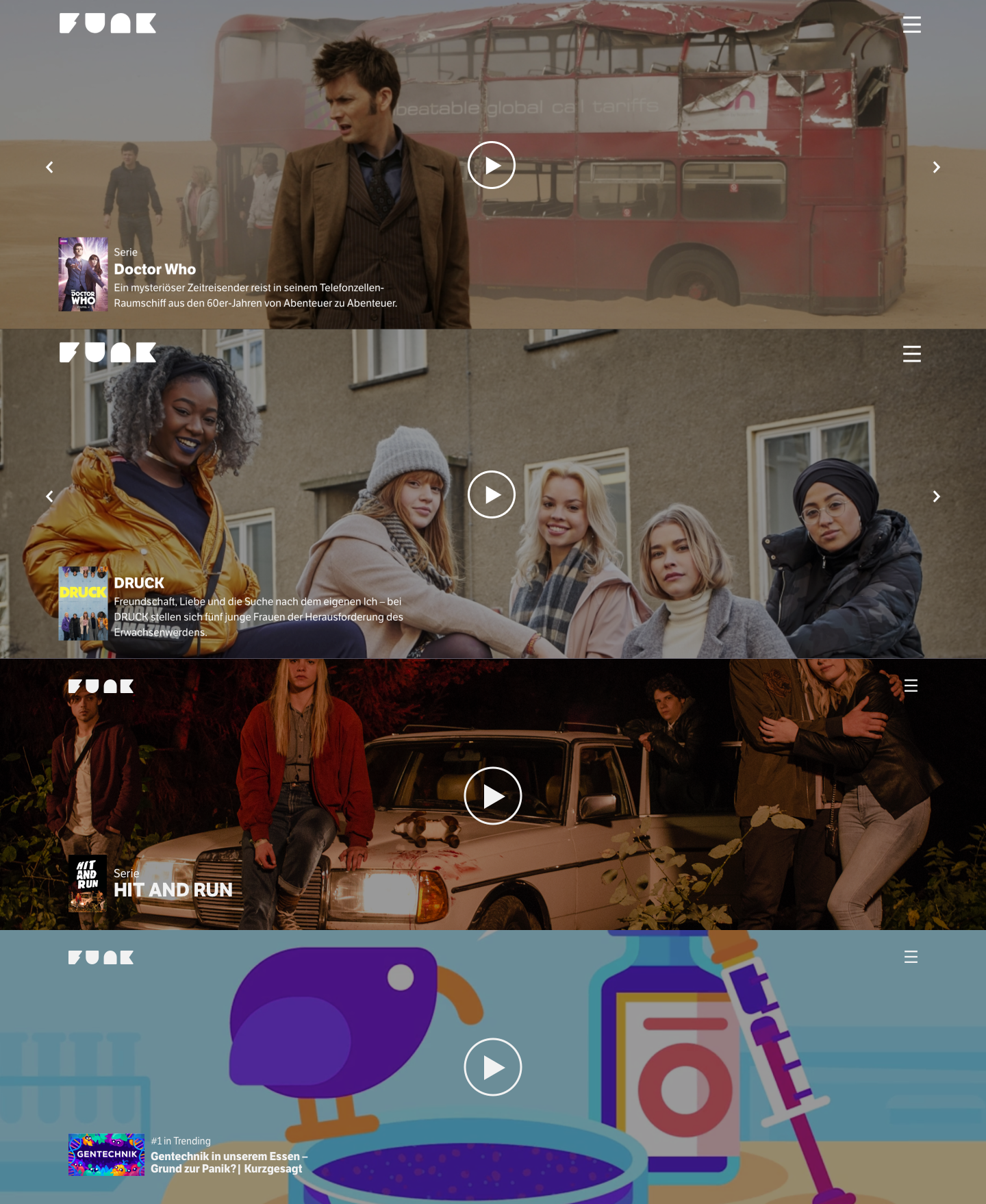
Improving the Visual Quality of the Start Page
On the newly created start page, we wanted to appeal to visitors that came looking for series and video content. To create a stage with a full-bleed background image, we needed high-quality photography stills. But most of funk's partner channels did not have any such images, and/or could not yet understand our use case. This had been a dead-end in team and management discussions for a while.
I argued that visual quality should be a valid requirement that trumped content "fairness" in this case. Management agreed that we could start by featuring only the handful of channels that already had high-quality assets. This change subsequently raised the visual quality of the page as we showcased why strong visuals were beneficial, and had in turn created an incentive for the other channels to be featured.
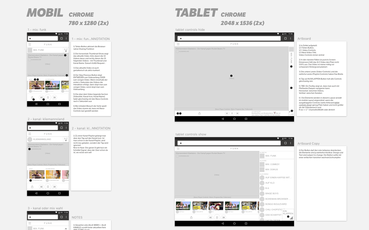
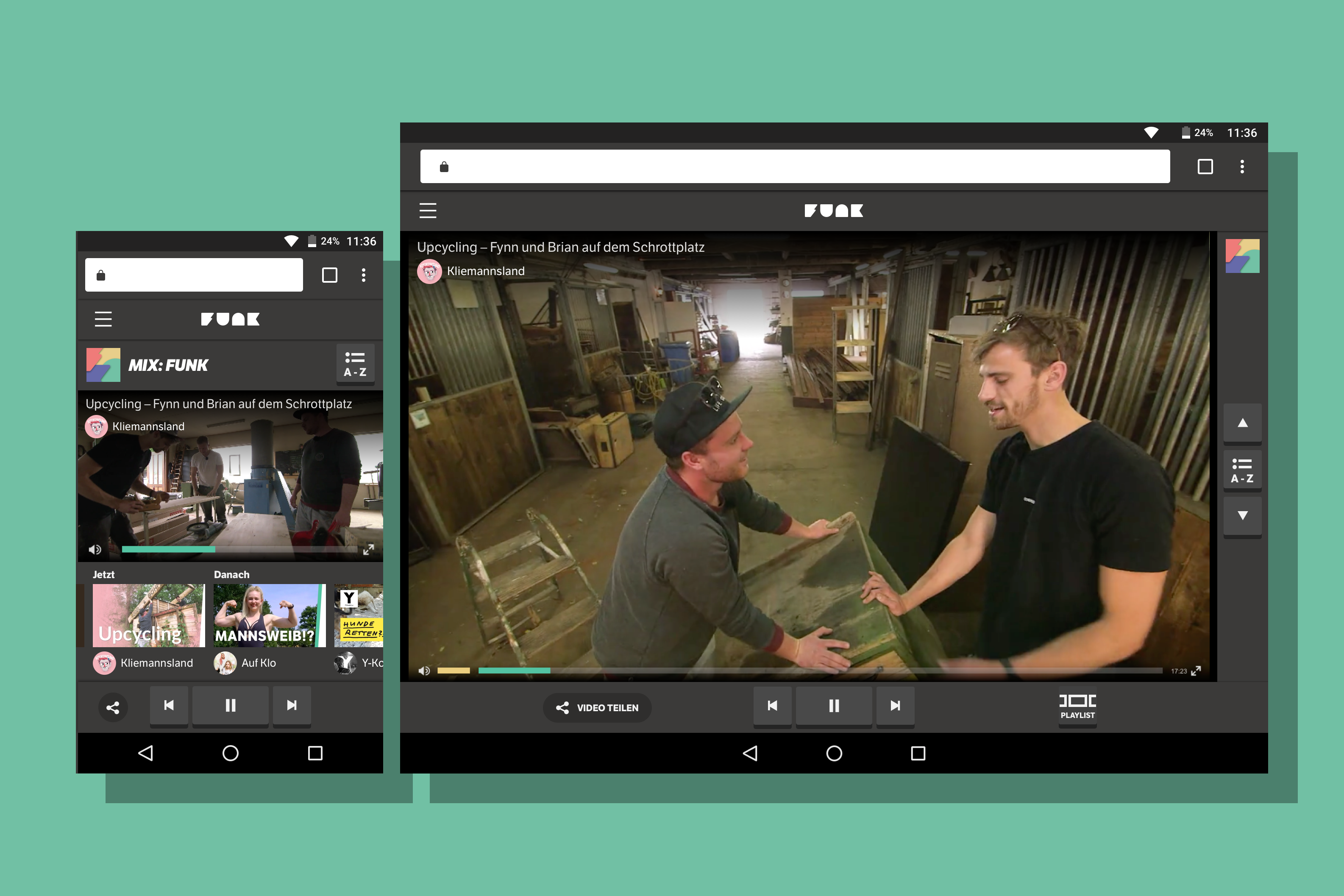
Improving Player and Navigation
In the player view, users were missing more prominent video titles, video descriptions. On small screens, navigating between videos or channels via decks was too complicated.
While redesigning, I took into account character counts in titles and descriptions, font sizes that were already in use, as well as screen breakpoints and dimensions.
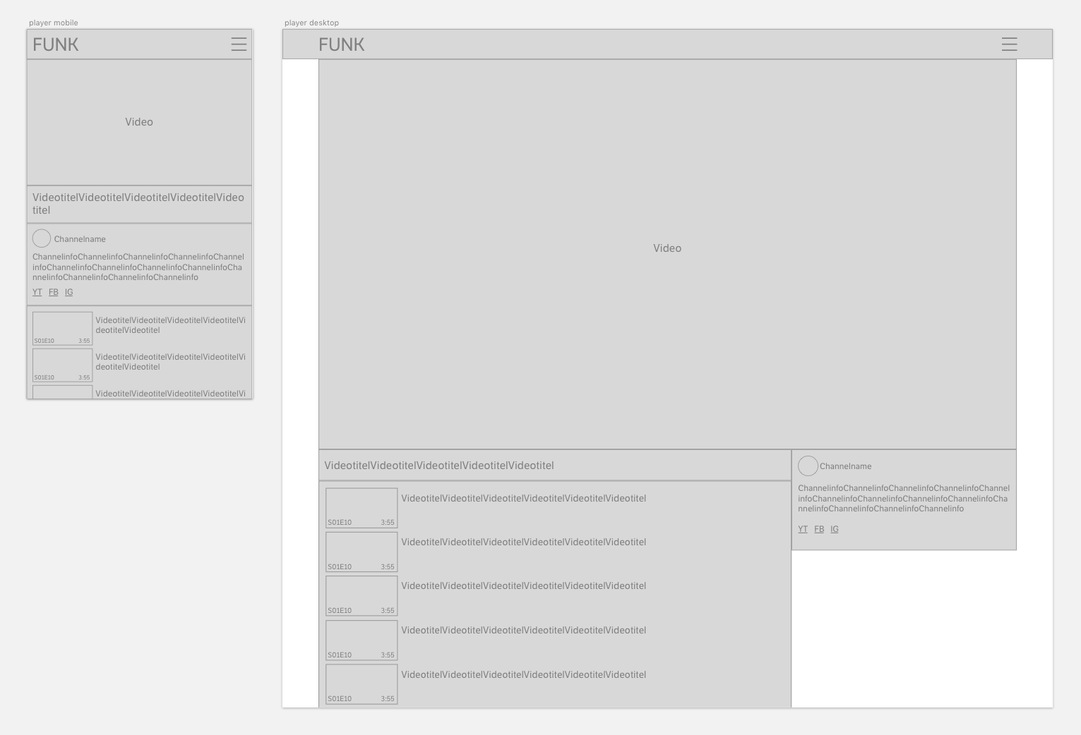
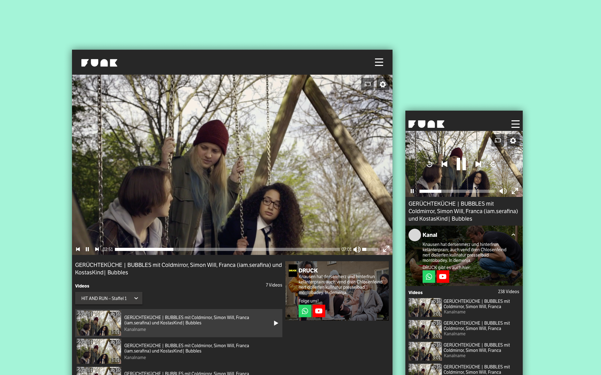
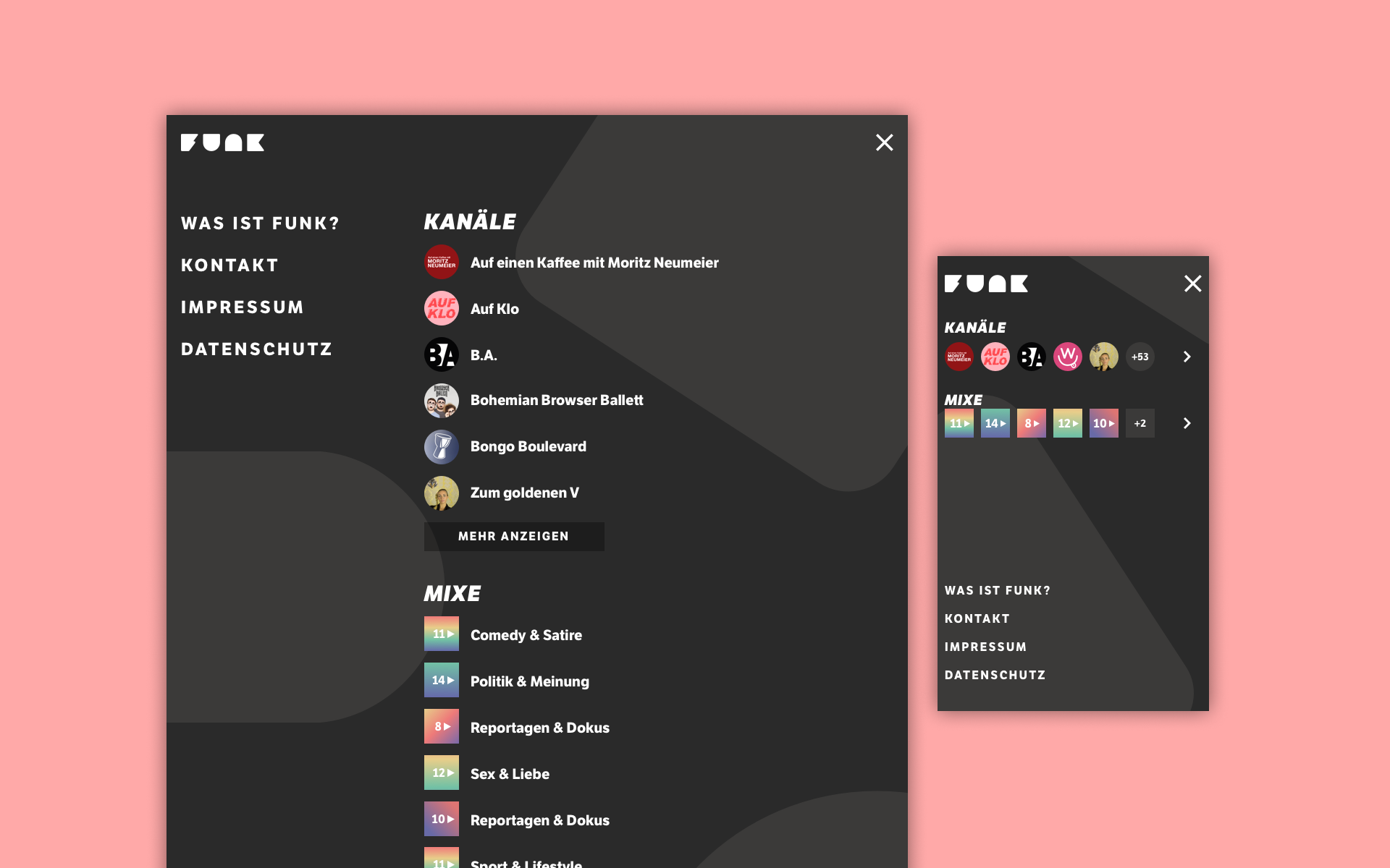
I also redesigned the main navigation. Users could find channels, playlists ("mixes") and the other pages such as Contact and About.
Insights from the Redesign
While working on this project, I improved my skills in responsive design. From here on out, I worked with a variety of breakpoints and a grid, being able to produce screen designs reliably for more than just one desktop and one mobile screen size.
I also enjoyed incorporating findings from feedback, tests and data to improve a design I myself had authored before. Over the course of the project, I learned to reflect, present and defend my design decisions.
This case study shows my path from beginner, self-taught UX/UI designer to a more effective and skilled professional – which is why I continue to include it in my portfolio.