Brand refresh and a new website for Berlin based developer studio
Plus B is a web development studio with 20+ years of experience in web development with TYPO3. They contacted me in 2023 to kick off a website refresh. In an iterative and collaborative process over 12+ months (90% remotely and 10% in person) I redesigned their website from the ground up.
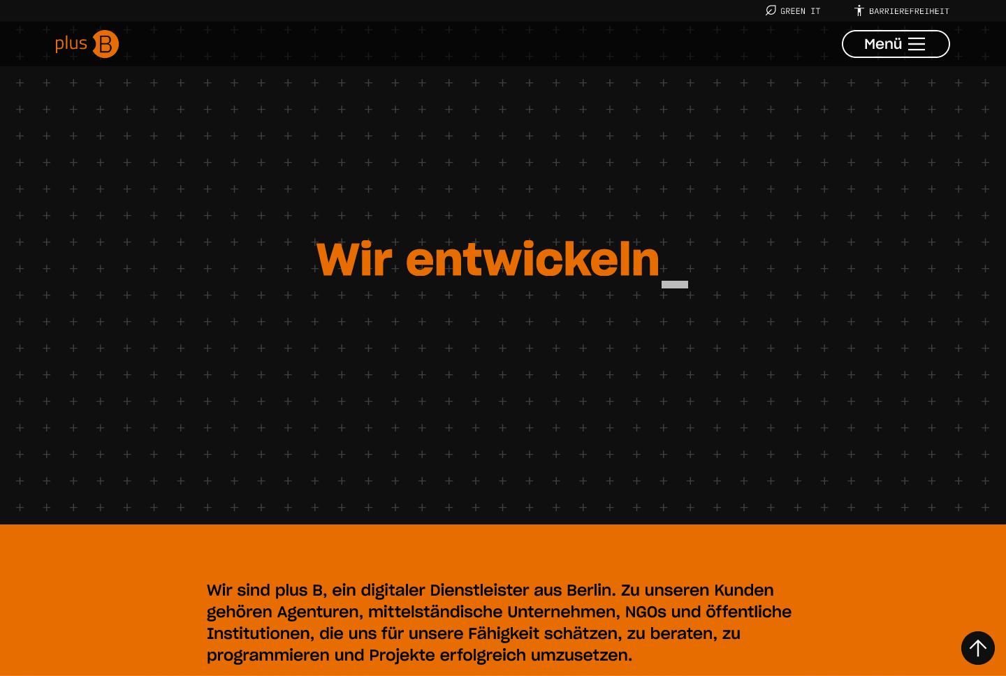
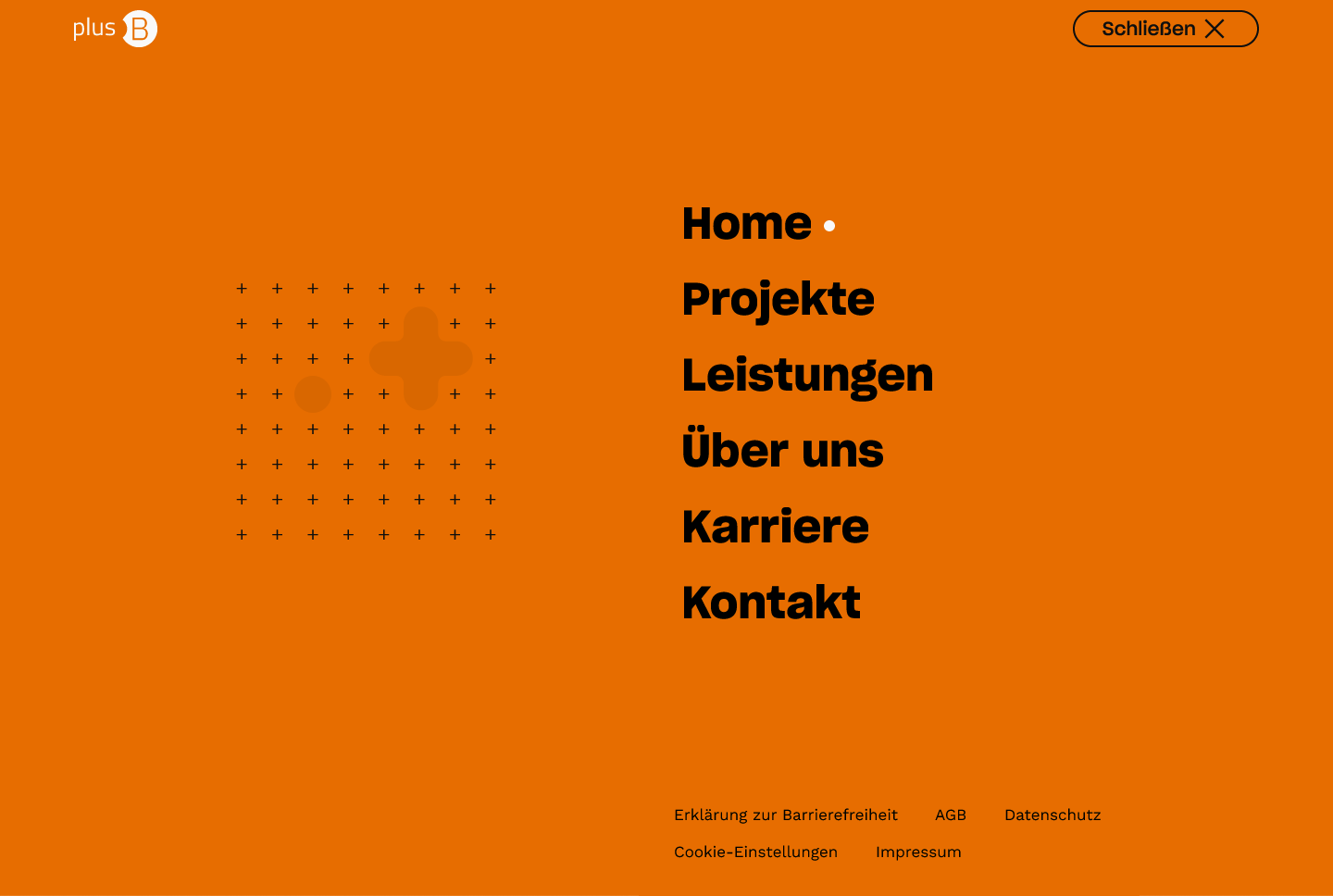
Our aim for the branding refresh and the visual design was to strike a balance between the outward and celebrated nerdiness of the studio and a professional and competent presentation. Orange as the primary brand color as well as the existing logo remained as a stable base for the duration of the project.
The scope of the project entailed responsive, bespoke screen designs for the landing page and several first-level pages, a template for project case studies, as well as layouts for static pages such as the 404 and the imprint.
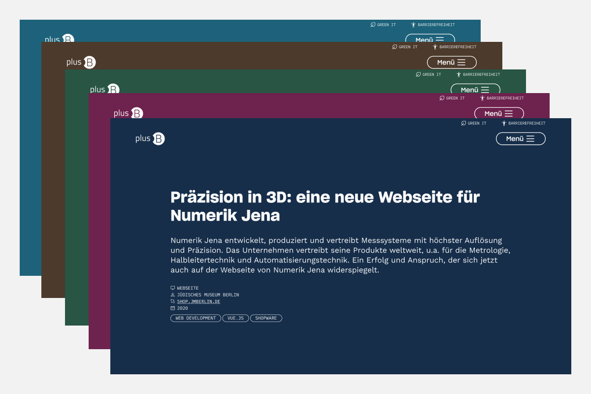
The project case studies invite a deeper dive into featured projects. To enhance this immersion I chose to invert the color theme and give each of the projects a hand-selected dark background color.
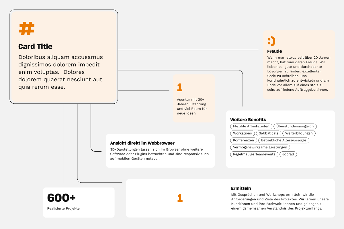
Working on the UI component library, I created a content tile template which can be applied in a variety of contexts and constellations. For example, the typographic element above the title (#) can be employed for numbered lists, for statistics, or for more abstract and decorative purposes.
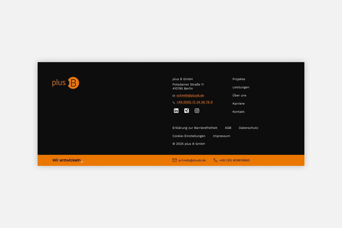
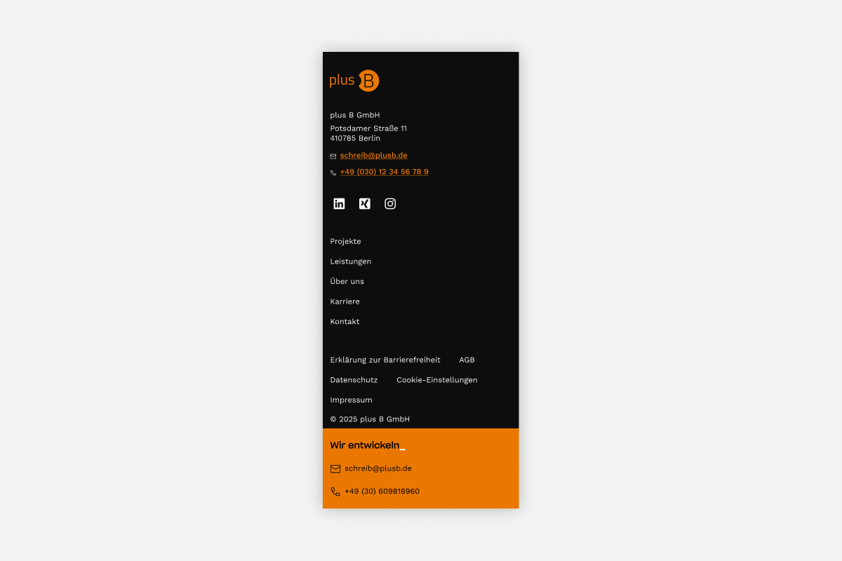
The footer accomodates legal links while also providing navigation to the main pages. Lastly, the orange ribbon concludes each page with the studio's claim and contact information.